Susie Leiper: All One
Susie Leiper is having fun. She works every day, but she only does what she loves. She’s bright, cheerful, enthusiastic, energetic, smart, and quick. She answers questions before they’re finished, rarely needing to reflect. She’s pretty much always right. There’s not much time to waste in her world. She’s in demand as a calligrapher and as someone who knows about Chinese art and culture. She’s writing diplomas for big institutions, designing CD and book covers, and collaborating with a range of architects, academics and curators in historical and creative projects. And she paints.
Her paintings have a freshness and vivacity about them, drawing on personal and professional experience, incorporating words, books, design, and nature (especially mountains). These are her key themes, and they are applied to various media that can be hung on walls, and to the flexible and portable painted sculptures that are her artist books.
Her studio, at the end of her garden in Edinburgh, is brightly lit, with white walls and polished floorboards. If she wants to do something messy she goes to a studio space at Wasps off Dalry Road. There’s a desk where she does her lettering – necessarily tidy, clean, ordered. There are interestingly bound books in small piles; boxes of folded old vellum; stacks of wrapped pictures and artist books; brushes and quills in jars; and a small number of pictures in progress, either set out on a big working table or leaning against the walls. She can open the drawers of her plan chest to find historical references, documents, scrolls, and a range of work that she’s produced over the last twenty-five years.
On the day of my visit, there are small padded assemblages neatly arranged and ready for perusal by the directors of the Open Eye Gallery in Edinburgh, where an exhibition of her work, On High Hills, will take place in April 2023. It’s her sixth solo show at the Open Eye, and it looks to me to be quite a development on the previous ones. This is an artist who is still searching, learning, and growing, always excited about what’s around the next corner.

Golden placidity - Oil and graphite on wood, 35 x 28 cm, 2023

The still dreaming world - Oil and resist on canvas on wood, 68 x 55 cm, 2022

Grass gully - Oil on wood, 46 x 36 cm, 2022
There are so many aspects to what Susie does. I find myself trying to categorise and compartmentalise – as though each of her plan chest drawers contains a different strand of work, badged up with phrases like Formal Calligraphy; Word Paintings – text and abstract painting; Abstract Paintings – mountains; Abstract Paintings – blocks; Artist Books; Public Art (see Appendix on Public Art below) but whilst at any point she might be working in a particular vein, there are no firm lines, no departments.
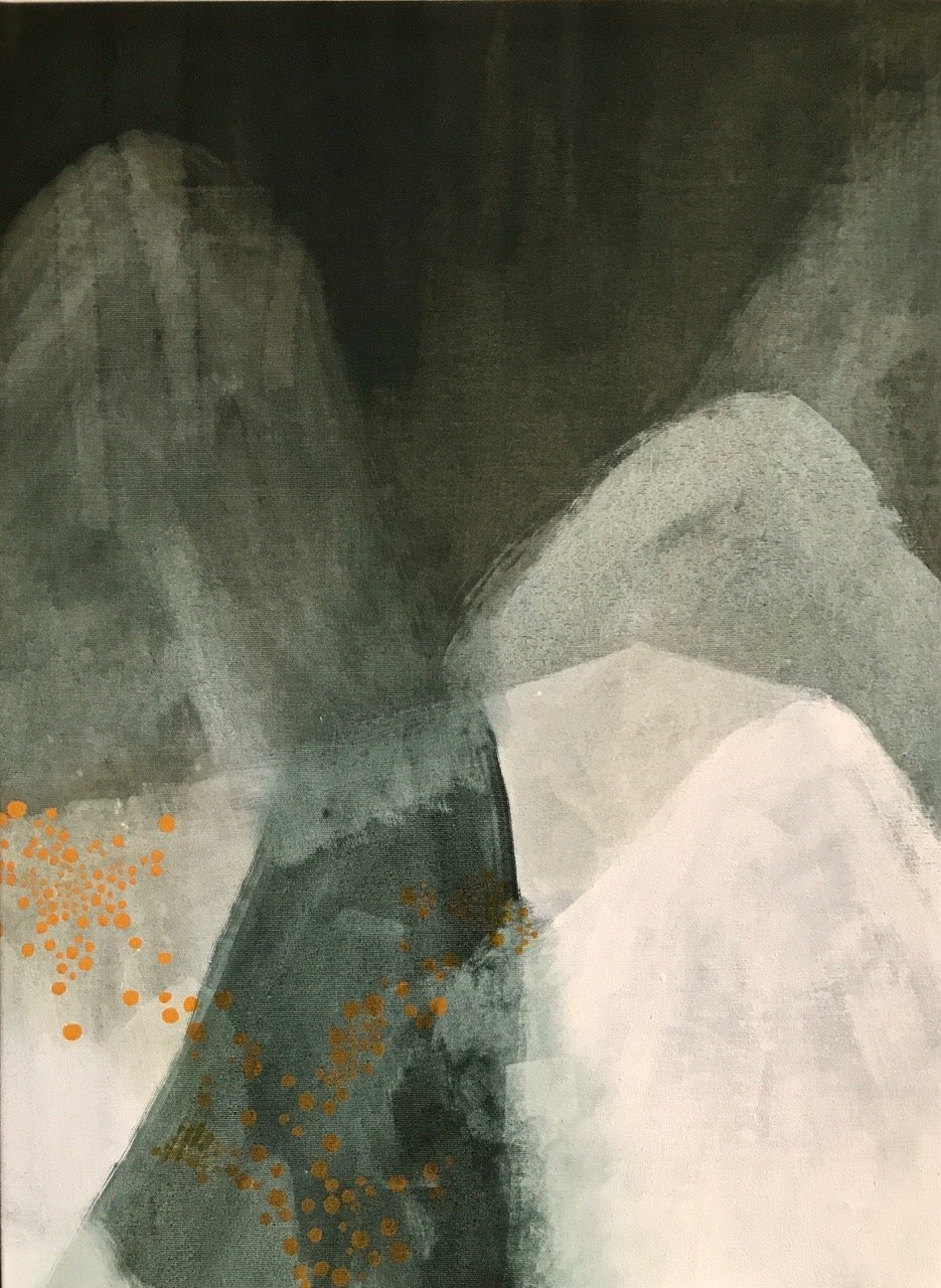
The recent work, from which the Open Eye exhibition will be selected, falls into the “abstract paintings inspired by mountains” strand. Later in this article we’ll discuss two paintings of Chinese mountains, Qilian shan and Huangshan, from 2009. We can draw lines from these pictures through to those of 2023, where surface, reflection and depth, or solid, liquid and air in some cases, are interchangeable. The viewer can bring different sections into foreground, mid-ground or distance, or toss them behind, throwing shadows or echoes.
“The exhibition title, On High Hills, comes from a book of the same name by the early 20th-century mountaineer and poet Geoffrey Winthrop Young. Young makes the wonderful comparison between artist and mountaineer: both feel a compelling impulse to make a mark on a forbidding expanse of white. His magnificent descriptions have provided most of the titles for the paintings in this body of work, paintings that range from the madness of jagged peaks and paths to the placidity of foothills and frozen plateaux.”
Susie uses her powers to work dense dreamlike patterns that evoke landscapes, sometimes playful and fantastical; sometimes frightening impressions of dangerous winter hills; sometimes conjuring up late evening low-angled summer sun over headlands. Everyone with a sense of the wild will be able to immerse themselves in these shapes, tones and overlays.
Perhaps the most stunning arrivals are the patterns of repeated shapes in golds and glowing oranges and arachnoidal black and white laces that float on surfaces, beneath which Susie works her well-known magic with blues, greens and greys, or beige and grey, now much deeper and richer, defaulting to darkness rather than light. Some of the work steps beyond her traditional mono- or duo-tone approach and throws her two favoured colour schemes together, dropping pink in as the contrast.
These are powerful statements, carrying different undercurrents to Susie’s traditionally muted subtleties. They command attention, and respond well to it. You can still lose yourself, but there are tougher consequences. This strand of her art is becoming more expansive, less rooted, freer and freer from its source seeds and nutrients.

Confusion of peak and sky - Oil and gesso on canvas, 75 x 55 cm, 2022

Rubbly rock bluffs - Oil and gesso on canvas, 75 x 55 cm

Wilderness of ice - Oil and casein paint on canvas, 95 x 75 cm, 2021
Does she feel she has to do something she hasn’t done before?
“Yes, a little bit. Also this time I felt I mustn’t get too uptight about it. I’m just going to carry on doing what I love doing and see what comes of it. Sometimes I’m making books, and sometimes I’m painting. And now I’ve got a body of work: what you’re seeing is everything I’ve been doing for the last couple of years, and the gallery will come and edit that a bit.”
Susie came late to the art scene, and without baggage. She hadn’t trained at a School. She wasn’t taught what to do. When she started she didn’t have a mentor, and she didn’t have peers. There was no one to copy or emulate, there was no support. She had to invent her own map with paths and destinations. She had an established career as an editor of books on Chinese art and archaeology (see Susie’s Bibliography in the Appendix below), in which she excelled, and where there were still many interesting opportunities.
She didn’t need to prove anything, she just set off on her own and instead of having the limited experience of the world (and the art world), that most artists begin with at art school and into their twenties, she started with the experience of travelling the world, working at British Museum Publications, next as an editor on international art magazines and books, and then as one of a team of renowned calligraphers who tested themselves at the highest level on the Saint John’s Bible project. The leader of that project, Donald Jackson, told her that her experience on the project would enable her to do pretty much anything with a pen. She took it one stage further and decided to see what she could do with brushes as well.
“I always wanted to be different: I wouldn’t join the Brownies because that’s what every little girl did. I have always liked doing things my way. The art world may have been new to me, but I have always felt a creative urge. In the mid-1990s there was quite a seminal point in my development. I was commissioned by National Museums of Scotland to write a book, Precious Cargo: Scots and the China Trade, and this made me realise that creating a book of one’s own was much more exciting than editing other authors’ texts.”
“That’s what made me think ‘I want to be a creative person’. I’m not a serious historian so I turned to what I loved: calligraphy. I could see a creative future in that. The other thing that was happening was that editorial work was becoming increasingly computerised and I didn’t want to sit in front of a machine all day. I liked making marks on a printed text, the way I’d been taught to.”
Calligraphy soon became Susie’s main job, even though she learned in an unconventional way. She shows me an offcut of vellum covered with calligraphic samples. “That’s how we trained on the Saint John’s Bible project. Although we wrote our pages at home, we went every two months to Donald Jackson’s scriptorium in Wales. There Donald would look at the page and say for example: ‘I don’t like your double letter g’, and he would help me with that, and then the word ‘Egypt’ is very difficult to write, so perhaps practise a little of that, get the weight right …”
“It was very, very hard. At the time it was the hardest thing I’d ever done. You had to write the same every day, cut the quill to the same width every day, and some bits of vellum were not nice, some were slippery. A cow has a flesh side and a hair side, and it’s much nicer to write on the hair side, which has a kind of nap, feels like suede, than on the flesh side which can be slippery.”
“Donald Jackson was a big influence. He was often sitting painting in the scriptorium while we were writing. He was doing the illuminations. Some of the painting was very precise, but Donald was not frightened to take liberties. For example, the illustration of the Creation, the seven bands, the seven days, was all done very precisely, and then Donald just took a big brush and painted a large black crow on top. That’s quite a brave and bold mark to make after doing all that detailed illumination.”
There were all kinds of challenges to creative development, but perhaps the biggest was that Susie’s character and experience were attuned to the pursuit of perfection. She could produce an edited article or a page of script that could look like a mathematical formula, clean and flawless. How could and would she disturb these hard-won and rare facilities to create art?
After the Saint John’s Bible project finished in 2006, she decided to find out.
Turning up at an evening class at Edinburgh College of Art, she embarked on her first painting with the instruction from the tutor to “just make a mark”, and so the new adventure started. The skill, discipline and control in handling a pen was set free from the shackles of correct language, style charts and text copying with no rules and a blank piece of paper. Of course it was Chinese painting and calligraphy that offered strong anchor points, and Susie had a Chinese box of paints at her disposal. The result was blocks of text set in black against hot swirling pinks, reds and oranges, with associated illustration of roof tiles, bamboo and elements of a Chinese garden. The text is English, written with a brush to look like Chinese script.

Susie describes the work in The Scribe journal in 2020: “I covered reams of Chinese paper in reds and pinks, not thinking. Perhaps I had already ‘let go of self’ as Donald Jackson had urged me to do. Working from The Mustard Seed Garden Manual of Painting (a Chinese ‘how-to’ book first published in the late 17th century) I drew elements of a garden on the painted paper, then developed a brush lettering script based on Chinese running script and inserted blocks of text into the painting. Descriptions of Grand View Garden from the Chinese classic novel Dream of the Red Chamber nestle among stylised pavilions and bamboo, and the title is written in pseudo-Chinese seal script. Painting and calligraphy share the same origin: both are executed with the brush. I then assembled the whole into a horizontal scroll. This scroll is certainly very Chinese in concept and appearance. It is not calligraphy as painting, but rather calligraphy on painting, although the two disciplines are fairly well integrated in a Chinese way: the painting illustrates the text, but the painting was also born of the text.”
There are advantages and disadvantages in being in a position where you are free from constraints and influences, but venturing into a new world without guidance it’s not surprising that Susie found herself combining exploration into the unknown with regular compass referencing to navigational tools in her existing skill set.
How did it feel?
“I was quite scared. It was quite liberating! That’s where all those bright colours came from. I was thinking: ‘Let’s see what this one does, splash them about’.”
The hot streak and the splashing about didn’t last long. An important step was signing up to a class at Edinburgh College of Art called “Approaching abstraction” with Paul Keir. Was this study? “Yes, but Paul wouldn’t use that word. Mentoring would be better. Paul’s not one to say ‘do this or do that’. You just turned up with some things and started doing stuff.”
The oriental world continued to inspire, but the Chinese paints and scrolls gave way to more meditative approaches, with limited palettes, absorbent materials, and techniques that championed subtle colour gradations, adumbrations, overlaps and veils.
“I think when I first went to that class I turned up with my little Chinese paintbox and little bits of paper. And Paul said I think you could work a bit bigger, and why don’t you try some oil paint? He didn’t really tell me what do with it, but I just looked it up and started working bigger. That (Susie points at the painting Qilian shan) was quite big at the time.”
Grand View Garden - Text from The Dream of the Red Chamber by Cao Xueqin
Handscroll: Chinese colour, gold and ink on Chinese paper, silk mounts, 30 x 300 cm, 2006

Qilian shan - Oil, casein paint, ink and graphite on canvas, 40 x 40 cm, 2009
Mountains had also become a central theme. Susie is a hillwalker as well as a Chinese cultural explorer. In 1985 she was able to visit the Dunhuang Caves, which are situated at the north end of the Qilian range of mountains in northwest China. Ancient paintings on the walls there have inspired the way Susie’s mountains are often depicted. “It’s the shapes of mountains that we saw in the cave temples at Dunhuang. The caves date mainly from the 4th to the 7th century. So these are very early examples of landscape art. Some of the caves were originally used as Buddhist meditation cells, but then merchants began to sponsor the painting of caves as a form of insurance that their desert journey would be successful. Some of my mountain ranges here are painted in chromium oxide green, mimicking Chinese mineral green – they’re not realistic, rather more stylised.”
There’s a printed textile feel about Qilian shan where four different profiles of the mountain range and its associated landforms are painted in black and green and dilutions thereof, each at right angles to the next on the square canvas. The painting can therefore be viewed from any one of its sides, perhaps representing the north, south, east and west of the mountain range. Maybe there are also subconscious references to a map, with the faint pencil grid. There are margins, as in a calligrapher’s text, on three of the four sides. The image demands the viewer slow down, consider simpler images for longer. There is a resonance with the ancient reverence for mountains in Chinese art, and perhaps for the way that Susie feels around mountains.
What were you trying to achieve here? “I was moving on to painting only, no words. As you say, looking at the mountain ranges from different perspectives, possibly also like an ancient illustrative map or even a journey through the mountains.”
Was the mountain the starting point? “Yes. I have always been intrigued by the prevalence of mountains in Chinese landscape art, and the almost religious feel of escaping to the mountains in pursuit of solace and higher things.” It was Susie’s first painting to be accepted for the RSA annual exhibition in 2009, and it still has a status for her.
There’s a partner picture that she references from the same period. It’s another Chinese mountain, or group of mountains, Huangshan, best known as a key inspiration for Chinese landscape painting and poetry. Spectacular peaks, chasms, pinnacles combine with gravity-defying pinewoods, mists and cloud. Today, you can reach the summit on a cable car or via steps, some of which are more than 1500 years old. Susie took the steps.

Huangshan - Oil, casein paint, ink and graphite on wood, 100 x 100 cm, 2009
Susie gets inside the hills, amongst the atmosphere. The rocks and the clouds tower over and envelop. This is not from The Mustard Seed Garden Manual, it’s dark, wet, threatening, immersive. “Some of those paths on Huangshan! You wouldn’t want to go near them!” she warns.
Like Qilian shan it’s painted from different perspectives, and can be viewed instructively from at least three sides. It’s an étude in black and white, an attempt to “balance texture, shapes, contrast in tone. I think a lot of my early work was fairly monochrome, I mean black and white.”
Keeping her painting free from poetry and words may have been a necessary process, but it was only a stepping stone to re-introducing them at a higher level. Susie was never going to reject her love of letters, but perhaps she wanted the painting to come towards the levels of expertise she’d achieved in the lettering world, before she tried to marry them again.
The process of re-engagement commenced in 2010 and reached its high point in The One Life 道 in 2012. Susie says this is “where the text and its meaning, as well as the calligraphy and painting, share one common purpose, one form.”

“This was one of my first large word paintings, incorporating writing as well as painted lettering, concealed and revealed by abstract painted shapes and marks. Painting, poetry and calligraphy come together. The text is from Wordsworth’s The Prelude, a long poem that evokes a philosophy similar to that of Chinese Daoism, that behind everything lies one universal life force, the dao 道,the way, the truth.”
“The impetus behind these large word paintings was a request to quote for writing Burns’ poetry on the walls of Burns’ cottage when they were doing it up in 2010. I looked into that quite carefully and wondered if I could do that on a wall in a damp horrible place. I thought: first of all I’ll see if I can write with a brush while standing, so I put up a big canvas at Dalry Road, and with a variety of brushes just wrote the names of Munros (Scottish mountains over 3000 feet, 917 metres) on it and thought ‘Oh! That’s straight! Oh, I quite like that!’ and that’s how all my big word paintings began. I surprised myself that I could do all of that freehand writing while standing, because I was used to sitting at my writing desk.”
Blocks of colour and scripted texts are superimposed. The colour scheme is duotone, indigo and orange, with gradations to grey and almond. You could think of it as a palimpsest where writers write their messages over existing ones. The paint is mostly thin to allow previous texts to be seen through the translucency, and the sense of this just being a fragment of a greater continuity is stressed through text arriving and disappearing on three sides of the image, and running drips of paint similarly arriving and disappearing at the top and bottom. These drips create a secondary veil, a rudimentary blind through which detail is obfuscated. Some texts are lost in the overlays.
“Mighty indeed supreme must be the power of living Nature” is the ultimate message – the one clearly written in white over all of the history. “This was the final line written: it’s the smallest script but the line has a powerful impact.” It’s a phrase that’s embedded in the historic writing too. All the texts resonate around nature, its power and its unity: ‘the mighty unity in all which we behold … all like workings of one mind …” phrases that carry through to Susie’s future Nan Shepherd project. Shepherd also talks about ‘All are one …”
The beauty of the letters and the way that they reveal and conceal their details can give the viewer the same sensation as if they were looking at a landscape and picking up different reference points, noting tonal colour changes; shadow and light; sky and land and water. The words and colours also carry echoes of mapping. But it’s the sense of history that gives the picture an extra dimension: the feeling that you’re looking at something which offers you an immediate experience and layer upon layer of historical references within the same image. It’s a profound concept, gracefully executed.
“Underlying all those Western words from The Prelude is a huge dao character 道, the way, the truth. That was done with a big roller before I started the painting. I don’t expect viewers to recognise that, but it explains the title of the work, which includes the Chinese character: The One Life 道. I think the bravery to do that came out of something I did at Patriothall where I created a whole wall of writing.”
“It was our first artist book group exhibition, and the question put to the public was ‘What is an artist book?’ which I painted along the middle of one wall. Visitors then wrote down their ideas of what an artist book was, and I transcribed them on to this wall. At the end of two weeks there was this massive wall of definitions and ideas, and then, because I had to paint the wall over at the end, I took a roller and just made a huge character chai 拆, within a circle, which means to destroy – you see that character all over China on buildings due for demolition. So that was the start of using a roller.”
Reading is a big part of Susie’s world and a key inspiration. “I suppose in order to be a calligrapher with some heft you have to have read a bit. You have to build a text. I went through a big Wordsworth phase and worked a lot on him. By 2015 I began to feel a deep sense of affiliation with Nan Shepherd, whose The Living Mountain reflects my own beliefs with her often spiritual and poetic approach to the Cairngorms. Shepherd invites the reader to look inside the mountain: into the hollows, the chasms, the burns, the lochs. This resonates with me and informs my work, with diaphanous layerings and geological strata drawing us further in.”
The Living Mountain is a book written during and just after the Second World War by the Aberdeen-based author and educator Nan Shepherd. It’s a book made for Susie Leiper and she’s made a book of it.
It’s a meditation on the Cairngorms, viewed from all sides and perspectives: geology, climate, weather, seasons, hydrology, botany, biology, anthropology, and it’s a book about Shepherd herself and her almost religious mission to be at one with the place – spending long periods of her time at weekends and college holidays immersed in the life of the high plateau and its skirting slopes and valleys.
Susie has handwritten the entire book and illuminated it throughout with her own designs and illustrations.
“Design” and “Illustration” are given secondary status in art schools, generally because they’re commercial pursuits. You only design and illustrate when you’re paid. Well, what do you call a designed and illustrated book made without external control or commission and with no commercial multiple intended? Perhaps it adds to the definition of an “artist book”. They’re usually primarily artwork and only use text for artistic purposes. Susie sticks to pages of text and pages of illustration and artwork, but the blurring of lines between calligraphy and art is already well embedded in her thinking by this time.
The one life 道 - Text from ‘The Prelude’ by Wordsworth over the character 道 dao
Oil and casein paint on canvas, 180 x 200 cm, 2012

Nan Shepherd, The Living Mountain, Susie Leiper edition - Ink, oil, resist and palladium leaf on Saunders Waterford paper, Each page 41 x 33 cm, 2015 – 2020
(a) Title page

(b) p. 85 Chapter 6: Air and light, chapter opening

(c) p. 86 Chapter 6, opening text

It’s an extraordinary work of art. In addition to Susie’s ambition and beautiful realisation, the text could be viewed as a painting in words. It’s one of the most sensual books you can read and Shepherd’s descriptions are those of a visualiser. She wants you to see and feel what she experiences. Reading the first page of Chapter 6, Air and Light, is instructive. Take her guidance on how to measure the quality of the light by viewing the shadows of feathery grass on a white sheet of paper; and luxuriate in her colour palette: “Every shade of blue from opalescent milky-white to indigo is there. They are most opulently blue when rain is in the air. Then the gullies are violet. Gentian and delphinium hues, with fire in them, lurk in the folds.”
Susie chooses to set a simple monochrome painting as the foil to the page of words, with sky in duck egg blue, hills in white (created by the resist method) and a jagged foreground in darker duck egg. A three-line visual haiku.
She regards The Living Mountain as a “major project”. It is one that few artists could conceive, let alone realise. There are 232 pages of writing and illustration.
It has a lightness of touch and a spirit of delight that Nan Shepherd would have revelled in. “I tried to work as spontaneously as possible,” says Susie. “ The script was based on the Saint John’s Bible script, which I could write with my eyes closed, the lines are not justified, and the text is in a single long column running the full length of the page.”
She uses irregular quadrilateral illustrations opposite the text in the spirit of the early French livres d’artiste. “I decided to use this uneven shape because I could then tear strips of masking tape and mask off the space very quickly, whereas if it had been a precise square I would have had to measure everything. I then just picked up a brush and made most of the marks quite randomly, in a medium that resists oil paint. Next I used a cloth to wipe on the oil paint, working fast with clean cloths to remove the oil colour. Every illustration was done that way.”
It’s very thin oil. Some of the illustrations incorporate thin darker lines, for instance in this word-picture, These wild places, the scratch lines are where I’ve taken a knife to the paper gently. It means some of the oil paint gets absorbed and is darker.”
(d) p.87 Clothed in air

The illustrations are not titled in the book. “No, they just sit opposite the relevant text, but to me they have a title, like, for instance, the teacups and the doors represent hospitality. And I’m looking at those from four directions – harking back to Qilian shan ten years ago. One of the most difficult chapters to illustrate, in an abstract way, was The Senses.”
(e) p. 177 These wild places

(f) p. 211 Hearing

(g) p. 215 Taste

(h) p. 217 Smell

(i) p. 219 Sight

(j) p. 221 Touch
What made her do it? “In 2017 I won a John Purcell (the paper merchant) paper prize at the RSW annual exhibition where I had two Chinese scrolls on display, and that was £100 or something – not very much – but I thought if I’m going to spend money on paper, I’ll spend money on paper that I use for a particular project. And I just thought that I’d like to write The Living Mountain. And I suppose I had the courage to do that having worked on the Saint John’s Bible and seen how a big book could be pulled together. I knew about the ordering of pages, that sort of thing.”
Up to this moment, I’d thought that there was an element of commercial interest and career development in Susie’s calligraphy. It dawned slowly and then very sharply that she loves the act of lettering just as much as she loves painting. She doesn’t see a line between them – perhaps embracing perfection and imperfection as all one.
Does she love making art out of words? Of course, “Yes… and balancing text and image, and fitting each chapter into a number of pages, but without too much control, that’s why the text is not justified, because then I could just set off. It was really difficult on the Saint John’s Bible to justify each of those columns. You took a deep breath when you got half way along a line and thought ‘I’m not going to fit this word in …’ You could go over a millimetre or two, but not much. As in the Saint John’s Bible, the paragraph breaks are marked by a small silver – actually palladium leaf – shape that echoes the form of the illustrations. This makes it possible to create two strong columns of text that will support the illustrations, and, like pillars, they run right from the top to the bottom of the page.”

(k) p. 43 Peaks piled on peaks

(l) p. 47 Water is speaking

(m) p. 118 Logs

(n) p. 166 Wrecked aeroplane
How did she sustain herself over all those pages? Maintaining the momentum must have been very challenging. “It was. And I got sort of stuck, because other things got in the way, but then when we had that terrible lockdown in March 2020 I thought: ‘Well, now’s my chance’ because I could go to my studio, which many artists couldn’t, and I just thought ‘I’ve got that book half made, now’s the time to finish it.’ I got the enthusiasm going again. It was a nice project to have in the background. I don’t go actively seeking work. I work to commission if the job interests me, but when I don’t have specific work on hand I do my own thing.”
Unfortunately, the public are not going to see the book. “I just didn’t get a publisher. I tried five, six, seven ... It would have been a very expensive project. Then I considered self publishing but the guy overseeing the production said, ‘You don’t want to spend your life packing boxes. I think we should pull the plug on this.’ So we did. The photos are there. It could still happen.” The original is currently waiting to be bound into a single copy by bookbinder Gillian Stewart.
While the Nan Shepherd book rested, a liking for the irregular quadrilateral laid the basis for a large painting in 2017. This work, aptly named Architecture of disruption (a phrase taken from the poet Norman MacCaig) is peopled by these shapes, here compressed, distorted, collapsed. The subject matter becomes a conceptual experiment on the interface between perfection and imperfection, skill and abandon. “I’m wanting to get away from the ruled lines and the 2.5mm writing! I just thought I want to make this wonky grid.”
The painting is almost square, the colours white, graphite and the bare canvas. Groups of irregular-shaped long thin quadrilaterals parade in rough horizontals. The spaces, or counters, offer their own architectural form, and can be interpreted as either foreground or background. Delicate shapes disturbed and distressed, producing a patterned plan that leads the mind in multiple directions without any conclusions. It’s an attractive design that’s been disrupted.
Susie can produce shapes and tonal colour with a degree of control and discipline that would enable an image like this to be produced in what a fabric designer or ceramic painter might regard as near perfection. The image started like this. There are elements of the final image that might be regarded by an artist as expressive, but by a craftsperson as clumsy or sloppy. Susie isn’t clumsy or sloppy. These are wilful moves to loosen up the feel of the picture, perhaps to make it look less clever, perhaps to make it look less skilful, perhaps to make it appear more painterly.

Architecture of disruption - Title from Norman MacCaig
Oil, casein paint and graphite on canvas, 180 x 160 cm, 2017
“I reckon the use of these repeated shapes is related to the act and appearance, the rhythm you might say, of writing and lettering. Or books on a shelf. After all, writing is about repeated shapes, usually in a horizontal line, and here I’m trying to paint, not write.”
“I did it very fast. I didn’t plan it or draw it out, I just did one row and then the next row and and then worked on top. I suppose the thing about calligraphy, like the bible or certificates, is that it’s just one thing on a piece of paper, whereas painting is more ‘well now I’ve done that, what do I do next?’”
Once she’d produced the wonky white shapes, she applied graphite in a very loose way, almost as though she didn’t really care. “Yes, I know. It’s almost like wrecking it. I could probably have got away with the original white grid on the bare canvas, which looked powerful, and I was almost tempted to do that, but there was something not quite right: the canvas was pulling on one side, so I thought, no I’ll keep going.” She let serendipity in, but there’s always a degree of control: “I’m making sure that the corners are relatively neat. I’m quite good at control.”
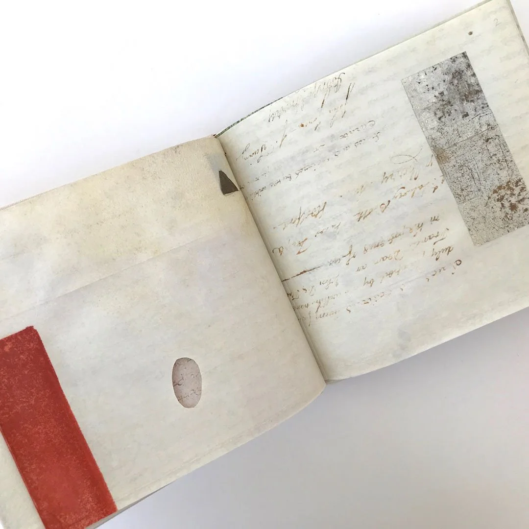
Architecture of disruption was painted in 2017 and was a forerunner of the next, slightly different, body of work. “I’m always searching for something new. I think that’s why I headed off in the direction of the work that became the body I called Library. I was looking again at lettering, but in an abstract way, and playing with vellum which is usually treated in a very precious way. I started being destructive to some vellum, folding and tearing it, sanding off the writing, and looking at the design of book pages, the concept of a library as a whole.”
“I have this big box of vellum documents and I’d always wanted to do something with them. In some ways they’re not really precious objects. They’re just legal documents. I’ve got two or three box loads of them, so I just started recycling them, working on top of what was there. It’s not my writing.”
Library, when it arrived at the Open Eye Gallery in 2020, coinciding with lockdown, had developed quite a way beyond experiments with vellum. There was a large oil painting suggesting metal-mesh-protected bookshelves; word paintings; paintings of irregular quadrilaterals as distorted book ends; small painted wooden tablets suggesting the seamlessness between art, design and illustration; and one-off artist books where Chinese referencing and old English script on vellum meet Susie’s playful shapes and colour.

Library - Oil and casein paint on canvas, 170 x 160 cm, 2019

Stacks I - Oil and resist on upcycled 19th-century vellum document, on wood
24 x 17 cm, 2019
Each work continued to be painted in one or two colours (in addition to white or the core colour of the base material). But the overall effect of walking into this Library was walls with blocks of muted blue/green/grey and beige/brown and winter green, with occasional bright orange contrast. It’s a palette that reflects Scottish nature. Susie is very conscious of colour subtlety and harmony. You feel she could have been a fashion designer, and she often wears the colour schemes she paints with.
The artist books folded out to reveal some much brighter colour contrasts. She likes strong reds in this format, denser tones, stronger contrasts. Memorandum, Catalogue, Documentation, Configurations, they’re called, suggesting word-packed reference material. There is some script and some lettering, but only as design tools in a world of abstract shapes and patterns.

Documentation - Artist book: upcycled 19th-century vellum documents, metallic paper, oil, canvas covers, Japanese stab binding, 19 x 23 cm, 2020
Susie goes to a drawer and gets out a small handmade book. Ruled pages are densely filled with very controlled handwriting and colour illustrations. “I made this little book when I was eight! It’s pretty neat, isn’t it?”
Why make books? She could paint twenty-five panels and put them up on the wall, but she’s decided to make them into a book. “Yes. I like books and I like the idea that a book is almost like a journey, following a path.”
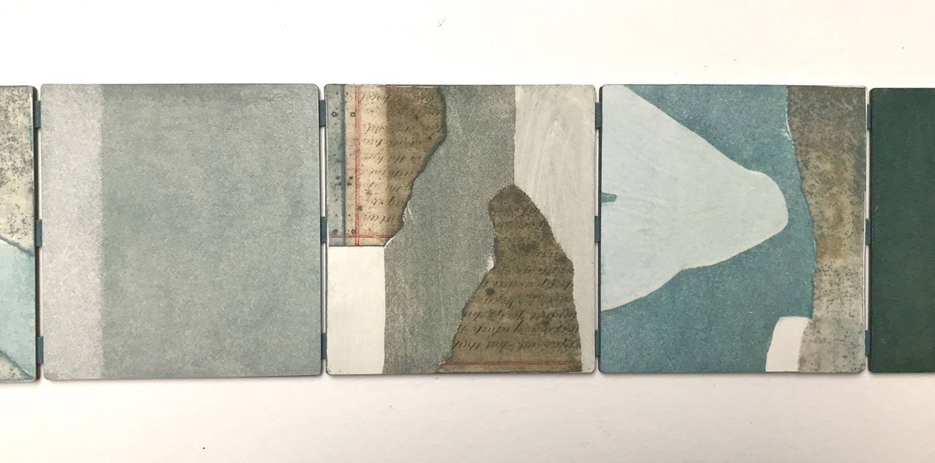
There’s a book on the studio table, packaged up. Susie opens it. “The only writing that’s mine is the title which I wrote on a scrap of vellum and then stuck it on to the wood. I chose to make bold red covers to pick up the red lines on these documents (points at them on a page), because sometimes I think I’ve got a tendency to be a bit monochrome. I wanted some more contrast. And it’s double-sided, so it’s like a sculpture. You can turn it round any way and configure it as you wish, but you can see the link to Mountain log: it’s the same paints, the colours that I use a lot. Simply because it’s a nice mixture. And you can go from blueish to almost dark green to a variety of greys, just with the same two pigments.”

Charting the mountains - Artist book: oil, resist and recovered vellum document scraps on board, wood covers with handwritten title on vellum, 14 x 14 cm, 2022

Mountain log - Oil, resist and recovered 19th-century vellum document scraps on wood, 12 x 40 cm, 2022
The books sit alongside paintings. They are the three-dimensional developments of the two dimensional. Made at the same time, with the same materials. The other object on the studio table today is a piece of wood, collaged with vellum scraps and then overpainted: Mountain log. “Again, it’s the mountain and, looking at it, I haven’t moved on from Qilian shan in that sense. The mountains are coming in at every angle – I’m looking at the mountain from various angles. I don’t know if you remember that sentence in Nan Shepherd’s The Living Mountain where she says: ‘… face away from what you look at, and bend with straddled legs till you see your world upside down. How new it has become!’ I think that’s very true.”
So the idea of mapping a mountain that perhaps started with the three sides in two dimensions in Qilian shan in 2009 and continued through the design, illustration and calligraphy of The Living Mountain, 2015-2020, continues as a key theme of Susie’s work, and in 2022, Charting the mountains is the latest iteration or refinement or expression, whichever way you wish to see the momentum.
Are there narratives to these books? “There isn’t in that one. I called it Charting the mountains because the collaged vellum documents are a kind of charter.” And if there’s no narrative, how are the pages sequenced? “I just played around with them. I’d made lots and lots of these squares and I just laid them all out and decided. I think it’s important to have some blank bits in amongst the busy bits.”

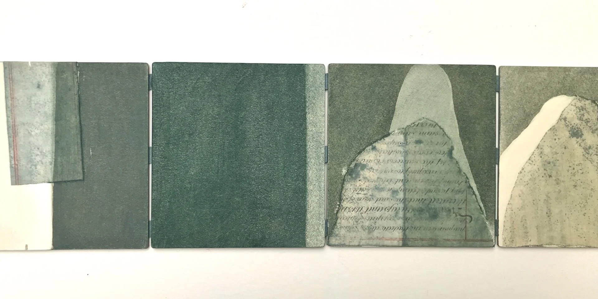

Charting the mountains - Artist book: oil, resist and recovered vellum document scraps on board, wood covers with handwritten title on vellum, 14 x 14 cm, 2022
The first question for an editor will always be the shape and size of the book. How does Susie decide?
“I know I made that book this size because I had these nice pieces of wood that I’d prepared and I thought I wanted to make a book that would fit inside them. I like random situations like that where the material dictates the outcome. Nearly all the plywood I work on is from skips, and what I like about that is that there’s a piece of such and such a size and I can saw it into shapes that have come from that original piece of plywood. I don’t go to a wood merchant and say ‘Please cut me six pieces that are all 120 x 120’. I love that randomness.”
“Books to me are very tactile and that’s important. You can display them, or you could just put them in a box and open them up from time to time. That’s what Chinese art connoisseurs did in the past. They got out their scroll, showed it to their friends, chatted about it and then put it away again, which is quite a nice idea. Because a book should sometimes be closed, shouldn’t it?”
Perhaps she likes the serendipity involved in how they’re going to be displayed or used? “I think so. Yes. Sometimes I like it when I put them into exhibitions, and they’ve laid them out in a way I wouldn’t have thought of, and I think ‘Oh. That’s interesting’. I don’t say ‘This has got to be displayed like this’.”
I love the idea that an artist book gives you the portability to take an art collection with you – on a trip, to share with other people, to give you a cultural thrill in a strange place …
“That was part of the attraction. I made a lot of books when we lived in Hong Kong for six months in 2001 because I knew I could bring those home in my suitcase, whereas I couldn’t bring pictures home so easily. I also like the fact that with a book you can choose the covers, the endpapers, if there are any, you can choose everything about it, and I can make it right to the end and even put it in a slip case and it’s a complete thing. You don’t need a frame. You don’t need to take it to a framer. Actually, I don’t frame much work. I used to, but I don’t now. I just like the picture on the wall without a frame.”
How did the artist book concept start?
“I think the first book I made was for National Museums of Scotland in 2000, for an exhibition called Source, where they invited craftspeople to find something in the museum collection and then make a piece based on that. There was a Chinese Ming dynasty woodblock-printed book in the Ivy Wu Gallery and I thought, ‘Oh, I’d like to make a Chinese-style book’ so I just went and bought a book on book-making and made the book.”
“My first book was illustrations and text. It was quite Chinese. It’s quite a tight book, following the principles of a Chinese Ming dynasty book. The text is legible and the illustrations are kind of Chinese style. The text is all about food, and written in English.”
Can she speak Cantonese and Mandarin? “A little bit. I like the discipline of learning a language and writing. I can write in Chinese, with a brush, although I haven’t done it for a year or two actually. But I always did it not with the intention of becoming a Chinese calligrapher because I don’t have that deep, deep understanding of Chinese poetry, text and language, but just because I like the discipline of the brush.”

Four small ‘manuscript’ paintings - Varying combinations of oil, recovered vellum, casein paint and silverpoint on wood, each 24 x 19 cm, 2019
Chinese art and culture, mountains, books and words are all influences. From the perspective of someone interested in Scottish art, a layperson (like myself) might imagine an awareness, perhaps even the influence, of artists like Philip Reeves. But Susie, remember, has no schooling in Scottish art history. Her art journey started in the 21st century. Reeves hardly registers.
She does have art influences, but they come from a long time ago. There’s Piero della Francesca, and lately a fascination with Masaccio’s Brancacci Chapel in Florence, painted in the 1420s. “When I look at the details of that, I can see myself in there … You might say, ‘Oh, it’s all people walking about in town squares,’ but it’s the colours and the juxtapositions and the shapes and the slightly distressed look of it that I find so nice. I’ve also been looking at those early Flemish portraits where they have a little window at the side and you look through to a landscape. Some of those are very, very beautiful. The landscapes are quite fantastical, and I think of what I once said when somebody asked me what I wanted to paint and I said ‘fantastical landscapes’. Is Huangshan fantastical? I don’t know, It’s unreal.”
So here she is, constantly editing her own interests, merging them into new configurations, but always following a mission to bring calligraphy, words, and art together.

The tang of height - Title from The Living Mountain by Nan Shepherd
Oil and resist on canvas, 155 x 150 cm, 2017
It’s the same spirit that pushed her to immerse herself in Chinese culture when she and her husband Julian arrived in Hong Kong in 1980, shortly after she’d graduated from studying French High Gothic Architecture at the Courtauld Institute of Art in London (she’d initially studied French at St Andrews University). Susie’s mother Frances Stewart was an artist (see Biography below) and had wanted Susie, who grew up in Glasgow, to go to art school, but Susie, as we’ve already found out, always wanted to be different.
Exhibition
Susie Leiper
On High Hills
Open Eye Gallery, Edinburgh
7 – 29 April 2023
Selected online material
Selected bibliography
Talking to Susie and discussing her work quickly made me realise the inadequacies in my knowledge of Chinese art and culture. I presumed I may not be alone and asked Susie if she could recommend a short list of reference books for those wishing to get a better understanding. Here it is – and many thanks to Susie!
Chiang Yee, The Chinese Eye, London 1935
Chiang Yee, Chinese Calligraphy, London 1938
Chieh Tzu Yuan Hua Chuan, The Mustard Seed Garden Manual of Painting, 1679 – 1701, facsimile of 1887 – 8 Shanghai edition translated by Mai-Mai Sze, New York 1956
Michael Sullivan, Symbols of Eternity: The art of landscape painting in China, Oxford 1979
Jean François Billeter, The Chinese Art of Writing, New York 1989
Craig Clunas, Art in China, Oxford 1997
Richard Barnhart, Yang Xin, Nie Chongzheng, James Cahill, Lang Shaojun and Hung Wu, Three Thousand Years of Chinese Painting, Yale and Beijing 2002
Maxwell K. Hearn, How to Read Chinese Paintings, New York and London, 2008
Maxwell K. Hearn, Ink Art: Past as present in contemporary China, New York 2013
Zhang Hongxing (ed.), Masterpieces of Chinese Painting 700 – 1900, London 2013
This is a personal selection. Also recommended would be any books by
Wen C. Fong and James Cahill.
And a few books related to the article:
Susan Leiper, Precious Cargo: Scots and the China trade, National Museums of Scotland 1997
Christopher Calderhead, Illuminating the Word: The making of the Saint John’sBible, Minnesota 2005
Nan Shepherd, The Living Mountain, first published Aberdeen 1977, then Edinburgh 2011
Geoffrey Winthrop Young, On High Hills: Memories of the Alps, London 1927
Public art
Susie has been involved in a range of public projects. She’s provided us with a list of work to date:
Commemorative handwritten and illuminated book, 2007, recording all donors to The Queen Mother’s Memorial Fund for Scotland 2003 – 2006, on display in the family room in Glamis Castle, Angus
Museum of Edinburgh, Royal Mile Edinburgh: Latin sayings from the façade of the building, and town cries, painted on the beams of the museum shop, 2012
Circus Café & Bistro, St Mary’s Street, Edinburgh: hidden in the small garden at the rear of the café are the salvaged doors painted with text about the Old Town of Edinburgh for the Hidden Door Festival, 2014, which took place in the vaults of East Market Street behind Waverley Station
Royal Bank of Scotland polymer banknotes: handwritten poetry in Scottish secretary hand, on reverse of each denomination: £5, £10, £20 and £50, 2015 – 2019.
Ranges, large oil painting, purchased by Edinburgh and Lothian Healthcare, now hanging in Royal Infirmary Edinburgh
Springfield Church, near Cupar, Fife: blessing painted on cornice of renovated church, 2019
Update, March 2024:
Susie Leiper’s book, The Living Mountain, has been beautifully bound by Gillian Stewart and installed in an exhibition at the Crafts Council Gallery in London, where it will be on show from 13th March to 13th April, 2024. Excitingly, Susie is working with Thames and Hudson to reproduce the edition through a funding campaign. You can find out all of the details at https://vol.co/collections/the-living-mountain
Frances Elizabeth Stewart (1915 – 2008)
(married name Gordon, mother of Susie Leiper)

Frances Stewart, either at Glasgow School of Art, c.1938, or at Hospitalfield, Arbroath, 1940 (courtesy of Susie Leiper)
Frances’s parents were very hesitant about her determination to go to art school, because of ‘the type of men she might meet there’! But Frances fought her ground and had a ball at Glasgow School of Art from 1934 – 1939, where she encountered, amongst others, the two Roberts (Colquhoun and MacBryde) and the film director Norman McLaren. In 1940 she won a scholarship to Hospitalfield in Arbroath, Angus, where she studied under James Cowie.

Frances Stewart (front left) with fellow students and teacher James Cowie (back left), Hospitalfield, Arbroath, 1940
A few years’ teaching in Glasgow schools were followed by ten years as a tutor of Art and Design at Gray’s School of Art in Aberdeen, 1945 – 1954. She claimed proudly that she was the first woman in Aberdeen to sport the ‘New Look’.

Frances Stewart at Hospitalfield, 1940
Her limited success as a painter was cut short by the arrival of two daughters (Susie Leiper and Sarah Macneal) when she was in her 40s, quite unusual at the time. She later taught art to students at Glasgow’s School of Domestic Science, popularly known as the Do School. When Glasgow School of Art mounted an exhibition of embroidery and weaving in 1995, The Unbroken Thread, Frances was one of the few living alumnae who could contribute to the catalogue.

Frances Stewart, W and Z, design sketch, 1940s