Rodger Insh: Painting Air
I’m looking at a picture of Suilven. It’s one of the best loved hills in Scotland. Why? It is less than 500 metres high, more than 400 metres short of basic respectability for many Scottish hill-lovers. It’s unique character is created by its single hill status, shape, location, and its friends and neighbours. In the North West of Scotland, a wondrously old landscape of eroded isolated sandstone hills emerge independently of each other from the rough tumble of rock and loch created by Lewisian gneiss.

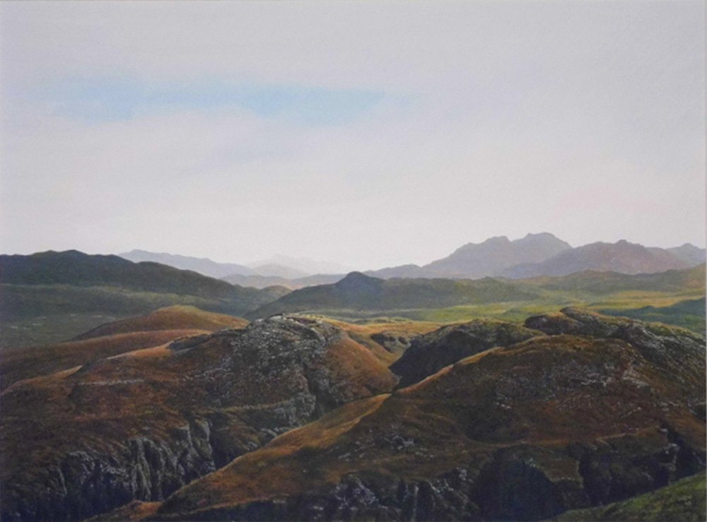
Suilven at Sunset
This picture looks at the mountain from the south east on a summer evening.
It’s not the most dramatic angle to view the hill. The foreground is in deep shadow. The next valley works its way from near darkness to full sunlight as it heads west. The picture takes the viewer from black-green slopes with dense black shadow to sun-kissed yellow-green grazing with soft grey-green shadows. Beyond, emerging from behind a well-defined ridge, the mountain’s singular silhouette looks like a human head resting on the Sutherland shores. Its western buttress a strong chin, the dip between its two halves a mouth, and its eastern pinnacle a nose. The buttress gleams as the low sun rays, travelling unchallenged from the western horizon, bounce off its steep slopes. There’s a pink gloaming settling in the air meeting the yellow reflections in the apex between foreground ridge and the base of Suilven’s cliffs. The long northern evenings allow for slow and subtle changes in light, colours, and atmosphere. A visual is not an ideal temperature gauge, but here we know it’s been a glorious warm summer afternoon, and is now settling, still into a cool evening, warmer in the late sunshine. The sky radiates brightness from that central apex, and darkens imperceptibly to a washed out pale blue. Later there will be all manner of darker blues, yellows, oranges and reds, as the sun moves round to set in the north,
If the resting head sat upright, it would look out, past a skirt of lochans and rock outcrop striations, over Lochinver, across the Minch, past the Butt of Lewis to the big empty sea horizons heading off to Iceland. Walkers know that view, and admirers of Friedrich’s Traveller do too.
Rodger Insh loves this land and all of its moods, and this picture is his painting. Like James Morrison, his Montrose contemporary, he revels in expansiveness. There’s no way that Morrison’s work could be mistaken for photography, but Insh takes the image back to the studio and paints all the subtleties in detail. His pursuit is a sense of completion. A painting is finished when there is nothing more to do. There can be no short cuts. He doesn’t want to hint at atmosphere, asking the viewer to fill in their own detail; he wants to paint it. This is tough work, and very exposed.
The central word in Rodger Insh’s art is control. He aims for complete command of his medium: no chances, no accidents, no reductions in intensity. This is a quiet, thoughtful man, who painstakingly considers subjects, calmly absorbs information through a sharp filter, and when he speaks or paints, often in bursts, chooses words or brush strokes carefully . His thoughts are precise, calibrated and often loaded with nuance, and he can articulate them very clearly.
He’s not prone to expressiveness, dreaming, mystery, or drama. He likes his interlocutors to know accurately what he sees and thinks.
“I am inspired by subject matter that allows me to investigate the classical qualities of composition, structure, texture and the contrast of light and shade. This has influenced my approach to painting throughout my career from the decorative and symbolic surrealism of the 1970s and 80s to subsequent realist landscape studies”
Rodger Insh was born in Kirkcaldy in 1950. His parents were both artists and his father taught art at Kinglassie in Fife, where the family lived, and where Rodger still has a strong memory of the view from his bedroom window looking over the mine buildings, and the miners' homes. He was six when he first drew a picture of that scene, and his parents recognised that he had talent.
When he was eight his father got a job teaching art at Auchterarder High School, and the family moved to Strathearn. His father was committed to teaching and rarely practised as an artist, but his mother, Kathleen Margaret Insh, was an active and enthusiastic painter, with a special interest in birds. Her watercolours are rich in fine detail, setting birds in their natural environment, with close attention to flora.
Rodger attended Morrisons Academy in Crieff. His mother was his key artistic influence in his school days. And his parents introduced him to the spectacular landscapes of North West Scotland on holiday trips; images that he held in reserve for later in his artistic life.

Ben Loyal and Ben Hope
He earned a place at Duncan of Jordanstone Art College in 1967 and graduated in 1971. He suggests that he was caught up in a pop art enthusiasm, but he thinks his main influences at college were Ian Fearn and James Morrison. Fearn's simple approach and strong colour made an impression, while Morrison's personal encouragement and support were to continue for many years after college. Rodger admired Morrison's big- vista landscapes and his ability to pick fine detail out of his expansive washes of land, sea and sky.
Rodger’s own work was balanced between highly refined life drawings and portraits, and abstraction. Influences included “Barnett Newman, Jasper Johns, Mark Rothko and possibly Warhol. Rothko’s abstracts felt as though you could walk into them. He had a way of using colour that was three dimensional. He seemed to get beyond just playing with shapes, he got back to basics in a painterly way. I went to see his work at the Tate and they haven’t survived the test of time. That quality didn’t seem to be there any more. It was as though the paint had dried up. It didn’t have that fluidity that I remembered. The nearest thing I can think of to a realistic abstractionist.”
The realities of the post-education world hit home quickly after his graduation and he was ready to follow his father's advice to get a teaching qualification as a back-up to his ambitions as an artist.
He got a job teaching art at Montrose Academy (Note 1) and life moved apace. He had a flat and a rented studio and there he produced- big, abstract paintings based on shapes and colour: big blocks of colour. He met Maggie, who taught at a local primary school, they got married in 1975, moved into a house in Craigo Street in Montrose, and soon had a young family - they have three daughters.
Domestic circumstances meant less space for his artworks: “Things that you do are not always by choice and there came a point where I couldn't do big pictures”.

Rodger Insh in his Studio
By 1974 Rodger had developed a strand of paintings based on symmetry, order, and strong colours. They chimed with the flower-power age and interest in Eastern religions, and could have easily been used as album covers for progressive rock bands. Rodger brought together simplified and often multiplied silhouettes of faces, hands, flowers, butterflies, dice, chessboards, and bare trees into interplay with graphic shapes and lines and reflected them down the centre of the picture. The paint is cool, thin, controlled. This was 180 degrees away from abstract expressionism. It was an artist challenging himself to be creative within the constraint of a formal structure. The result was a sense of order and resolution.
Many pictures used a palette ranging blue to red, with pinks, mauves, and purples to the fore. There was an exhibition at Kirkcaldy Art Gallery in 1975 with Stuart MacDonald, and he also showed them in Pitlochry the same year. Another solo show followed in Carnoustie in 1976 and there were pop-up shows in Montrose. Rodger described his medium for the larger pictures as PVA (polyvinyl acetate) on canvas, whilst using gouache on board for smaller ones.
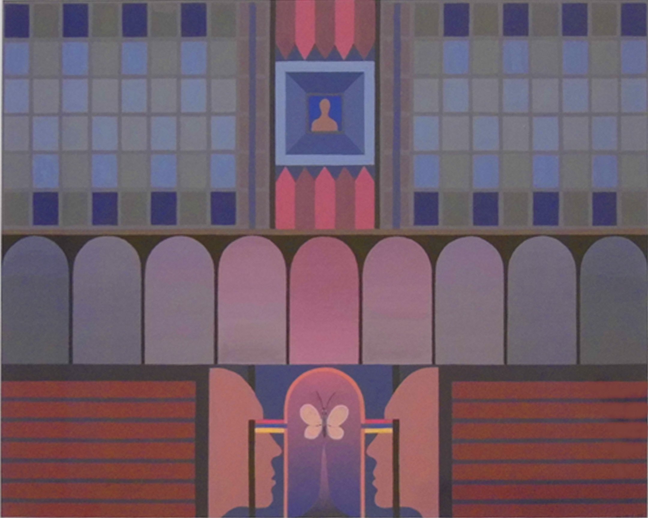
Guessing the Future
Guessing The Future (Gouache on Board, 1977) was one of the final images produced in this mode. The subject is reflective with two identical face silhouettes mirrored to look at a symmetrical butterfly image. A smaller head and shoulders profile is placed in the centre picture sitting square inside a picture frame. These are the only non-graphic images in the painting, which otherwise offers four blocks of patterns of repeated shapes, each with their own gradations of blue to red, where each shape has consistent colour but is juxtaposed with an identical shape in related colour. Two yellow lines linking the human eyes to the box in which the butterfly is placed stand out from the red-blue orthodoxy. The blocks of shapes and patterns intensify towards a cross, or an altar, and the atmosphere created by the multiple fragments of different colours evoking muted stained glass is reverential. Rodger always has every nuance worked out, and there will be no accidents. The title and the imagery will reflect clear thoughts. Rodger and Maggie's first daughter, Lucy, had been born in January, and this was painted and titled in June 1977.
Unfortunately, there was a very limited market for the tightly wrought, densely patterned abstractions of a young artist. But Rodger wasn’t locked into this style. He already had figurative drawings and large abstraction in his armoury. He wanted to be an artist who set standards and upheld principles, but also one whose work would be recognised and sold. Inspired by Jimmy Morrison and his landscapes, he thought he should see how he would deal with the challenge of a landscape. He transferred his skills in planning images, controlling paint and producing meticulous detail, from abstract pattern to looking at the real world.
Rodger says it took a long time before he was happy with what he produced as a landscape painter. He suggests that it was nearly twenty years before what he produced became something that "gelled" for him, that satisfied him. Whilst he was delighted to start being acknowledged by galleries and the public, he was not completely satisfied with his early output. He was selling paintings, but he wanted to do better, and was constantly striving to satisfy a drive for perfection.
At some point, Rodger started to think of his landscape subjects as characters. He recognises the landscape description, but he regards many of his landscape paintings as portraits, and his role as a portrait painter, looking for a likeness, but trying to get beyond the facade.
Rodger is a studio painter. No fast, Morrison-style plein-air work in his world. On average, he might take three to four weeks to complete a painting, and he usually works intensely, holding the tone of each section in his head and his brush until he’s satisfied he’s secured everything he wants.

Ben Loyal Panorama
Photography is a key element of the artistic process. And he realised, at an early point, the necessity to capture his subjects in the right light, from the right angle. He was always attracted to the complex shapes, surfaces, and shadows of vernacular buildings, especially agricultural ones. The Montrose Basin and the Mearns offered a range of options. Meanwhile, the family started taking holidays in North West Scotland, and he quickly saw the single hills of Sutherland as characters worthy of portraits. Rodger considered the best image and held it in suspense waiting for the light to change and atmospheres to evolve. Once the image was right, he captured it on film and later, digitally.
Rodger does not regard himself as a photographer (although you can buy some of his photographs online), and he's not a camera technician. He says that he could have taken some of the photographs that he used in his paintings with a phone-camera. However, the images he collects are the basis for his pictures. In his studio, they sit alongside his paintings as constant references.
It is nearly always gouache on board (Note 2), and always Winsor and Newton gouache. He starts with the sky, and straight away he sets and controls the tone of the painting. Then he works steadily forwards from the horizon, carefully managing tonal change as he progresses.
He says that his primary concern is not the subjects, "I paint the air between myself and the image". There you have the magic of a Rodger Insh landscape painting distilled. It's all about the air. In wild lands, farm lands, buildings, it's the way that light hits surfaces and the way it looks between the constituent shapes in the image; whether they're hills, rolling countryside; trees, houses or farm building complexes.
An agricultural building, with multiple angles, protrusions and recesses, offers the challenge to consider the weight and gradations in each tone, and suggest to the viewer the density of the air in close and distant parts, via the touch his brush applies.
Lower sun-angles are often favoured for his buildings and his landscapes, offering big contrasts in sunlight and shadow, picking out rims and edges; the subtle tones of blue, violet and magenta in shadows: winter in the east, summer evenings in the west.
Rodger's insistence that it's taken a long time to hone his craft to his personal satisfaction, is somewhat challenged by the evidence. From a layperson's perspective Sara Eating Crisps, Ferryden, (gouache on board, 1990), is an important work produced by an artist of consummate skill whose eye for image and technical production are measures of great artistry and craftsmanship. Rodger hints that there might be elements he would tackle differently, but he admits to it being a picture he's proud of.

Sara Eating Crisps, Ferryden
There aren't many humans in Rodger Insh paintings, but his young daughter, caught in unposed innocence on the shore of the old Ferryden - before the transformation that came with the oil industry - looks completely natural.
And look at the character of the main subject! I count ten different planes just on the front of the building, some of which have multiple surface textures. Rodger’s touch sensitivity and the delicacy with which he can choose and apply pigment is fabulous.
His shadowed wooden walls, stained, painted and peeling at different stages, are fully exposed in subtlety that challenges the viewer to continue to interrogate detail to a degree where few paintings can continue to offer, and photographs pixillate.
His gleam bounces back off the side walls, deflects off the roofs, and works its angles around the curved hull of a leaning boat. Look at the light reflecting on the window panes in the far left of the picture, and the extra sheen on the wooden uprights to its right.
Only Rodger knows what was there, what the image could be. Many wouldn’t need to be this complete. But Rodger does. He doesn’t rest or relax until he’s captured everything he possibly can. Control is key, there are no short cuts, and the finish has to be accomplished, a job well done. This is a master of his craft.
Take a look at the details in the ten window apertures, the sash window slightly opened; the shadow on the half closed curtain; the reflections; the hint of items placed on windowsills; perhaps even some broken glass; Rodger’s eyes see things that others lose through lack of attention; they are constantly alert to fine points and minutiae, and once he’s seen it, he has to paint it.
Frighteningly, Rodger regards this as a painting produced during his educational or developmental phase. When pressed to suggest paintings with which he is completely satisfied, he offers View From Ardnamurchan, Looking East (gouache on board, mid 2010s) and the last landscape he painted, Suilven At Sunset (gouache on board, 2015). He uses the word “gell” a lot. And these paintings did it for him. They came together to match his ambitions and hopes.

View from Ardnamurchan
View From Ardnamurchan Looking East emerged from a twist of fate, with a holiday house booking transpiring to be there, rather than where he and Maggie expected, a hundred or so miles further north. They didn’t realise the error until they were en route, but the results were stupendous. Away from the big hill personalities of Wester Ross and Sutherland, Rodger challenged himself to produce layer after layer of subtle tonal change.
As always, the sky was painted first, and then he worked from the most distant point, saying that this was the only way he could control the tone. You can’t move around the painting. You have to complete the element of the picture that requires the tone in which you’re working and then move on to a different mood. The result is a chromatic vision of extraordinary subtlety
In the world of painted realism, foreground is often a challenge, and in both of these paintings, there isn’t any. In Ardnamurchan a high vantage allows Rodger to look across a valley to some craggy, deeply riven low hills; and with light streaming in from an upper right angle, most of the foreground is subdued in shadow, and the eye’s attention immediately moves to the middle ground and the far horizons.
Two previous Suilven pictures, Wintry Suilven and Summery Suilven have challenging boundaries between the less focused painted foreground (in Winter Suilven it’s only a tree) and the middle ground/horizon where the eye focuses naturally on the definition. But in Suilven At Sunset, Rodger presents a dark foreground, where the evening shadow obfuscates all visual interest and immediately throws the eye to the subject of the portrait. The hill.

Suilven At Sunset (Detail)
I wondered whether this had been his last landscape painting because he knew he could not better it. He’d reached perfection in his craft. Suilven too had been a constant inspiration, and here it is , in a very dark setting at the end of the day. Could he do any better? The palette is limited, but worked in detail with extraordinary control of tone and a seemingly perfect capturing of the thinning sun’s rays on the cooling atmosphere . Rodger suggests that the title had a meaning and a resonance for him, but seven years on, he couldn’t rule out further work in the landscape genre.
The landscapes have given Rodger a great degree of satisfaction and for the majority of the art public they define his art, but sitting in his store are paintings in a very different mode that mean a lot to him. Many have been there quite a while without any public exhibition. They are abstract pictures, but not patterns and symmetricals. They are freely expressed and sometimes deeply emotional works.
There are multiple examinations of shapes and forms, colour and tone in free abstraction, with referencing to Kandinsky and Surrealism, but most effective where ragged and distressed forms are invested with a range of muted colours using ink, ink washes, and crayon. Throughout the early years of Rodger’s meticulous landscape realism, he was maintaining experimental practice. Much of this was in private but a few pieces were made public.
However, by the mid- to-late 80’s “the landscapes were so successful that I didn't have the time to give these sketches what they needed to bring them into something more substantial, and then it just got forgotten about.”
Abstraction was not completely sidelined, and in 1993, Rodger produced another series.

Some Men Watch While Other Men Drown
Let’s look at Some Men Watch While Other Men Drown . Rodger explains: "This is one of a small number of pictures, which are based on the Ben Doran disaster. It's quite a tricky subject for me, and you'll understand when I tell you. My grandfather was a deep sea fisherman from Aberdeen and in 1930 his boat floundered on the Ve skerries in Shetland and all hands were lost. His body and one of the others was found on the foreshore in Shetland once the storm had died down, and he had a rope tied round his waist. He tried to swim from the boat to the shore to get help, but he never made it. He left a wife and four kids in Aberdeen, and that whole thing affected me. I did eventually face up to it and try and make pictures that expressed what I felt. That was one of them. There were two or three others. I tried to express total loss". Did he have the title before he’d painted the picture? "I don't know. I think the title to me expressed hopelessness. If you've got a floorboard to support you, you can cope, but if it's taken from under you, you're kind of lost."
“These were produced while I was doing landscapes. It's a similiar sort of event to the Iolaire Disaster. I thought I couldn't do the Iolaire thing because I wasn't personally involved in it, but I was in this, so I could do it." Another picture in the series is called Divers. "Yes, they had a dive on the wreck. They got a few artefacts from it that are in the Lerwick Museum, and possibly some in the fisheries museum in Aberdeen." It seems a long way from the normal controls. "I don't agree. Something that intrigued me back then was the process where you would just start off not knowing what you were going to do and gradually work it through what was beginning to appear on the board. It's the total opposite of the way I normally work and pretty well done in a ‘oner’. They’re very personal pictures". Rodger thinks he has five pictures in the series but they’ve never been exhibited together. “It was a subject I thought about for a long, long time and eventually thought I have to get it off my chest. That title is really what it's all about: 'Some Men Watch While Other Men Drown'

Divers
His school teaching continued through to 2012, and then it was into full time painting “ I retired and I produced work for an exhibition at the Botanic Gardens in Dundee. That was quite intensive, a lot of work went in to putting that together. It was a mixture of landscapes, twenty or so. It was 2014 and the exhibition was called 2014. There were 20 landscapes and 14 of the digital pictures".
The digital pictures related to his longstanding interest in Victorian photographs. He’s been an avid collector for many years, and at this moment his hobby crept into his creative work. Early photographic images were embedded into symmetrical patterned abstracts, or embellished by digital framing and artistic enhancements. The concept extended to new photographs being subtly altered to make the real surreal.
Rodger says he’s closed the door on the Digital Art period. He wasn’t completely satisfied with it and thought he couldn’t take it any further. "I'm a mechanical person. I'm not an electronic person. I'm not a 21st Century computer person. I use them. I've produced art works on them, but ultimately art is personal. If you do it on a machine, something gets between you and what you're doing.”
Rodger thinks he has sold around 200 landscape paintings, and there’s been a steady sales flow throughout his career. But from 2015, the sales from the galleries in which he showed his paintings dried up, and the landscapes started to stack up around the house – well, especially in the basement.
That was one of the spurs for a new direction. The Iolaire Disaster was another. Rodger reminded me of the substance of the event: 201 young men returning to Lewis after fighting in the First World War, were killed in a shipwreck within eyesight of Stornoway Harbour. On a trip to Lewis, Rodger was deeply moved, and when combined with the strong emotions he felt reading Wilfred Owen’s poems, and about Owen’s life, he resolved to paint.
However, his trusted methods of gouache and board seemed inappropriate, and he decided that the way he needed to tackle the challenge was with a set of coloured pencils that any soldier might have been able to carry with him to the trenches in a tin. "They weren't paintings. They are produced as if they were paintings, but they're not paintings"
He considered the images that artists had produced from the first world war, and decided against trying to recreate history. He found himself returning to the creative world of Guessing The Future: pattern, symmetry and pure colour. He says this style is a better reflection of himself than his landscapes, however content he feels about much of the last twenty years working in the idiom.
These First World War pictures are all crafted compositions, where motifs from the war and the war poems are used in symmetrical patterns with boxed colour co-ordination. There’s a resonance with stained glass design. All thirty commenced life in what Rodger describes as sketchbooks. These are extremely neat Ring bound A5 books, but there’s nothing “sketchy” in them at all. They are packed with mathematical calculations, colour schemas, and complex coloured drawings that are beautiful miniatures of the final products.

Finale on The Oise Sambre Canal
Rodger shows me Finale On The Oise Sambre Canal . I look at it and wonder what to think. At first it seems like a computerised interpretation of a stained glass and kaleidoscope mash-up. It must be produced by a machine because it’s so perfect. At this point I was unaware of Rodger’s pre-landscape Guessing The Future work. I did, however, know his work in Digital Art, manipulating photographs and paintings into new, often fantastical images, using computer software. Perhaps this was the starting point for the new WW1 approach?
I start to focus and realise that this is the same artistic impulse and the same artistic technique being applied afresh in a new visual world. Control, detail, subtle tonality applied in pattern and symmetry. But what are these shapes? Rodger suggests that he might not be able to explain what’s happening in the picture. He’s forgotten the intricacies of all the connections and references. He was deeply engrossed in the subject for a period of time, but that was pre-Covid, and there’s been no necessity to rehearse the ideas, because there’s been little/no public exhibition, and no need for his further engagement with the particulars of any of the pictures.
But what’s this central motif? “It’s the gun sight and cross hairs of the rifle that shot Wilfred Owen, on the last day of the first World War”. And what are these? “They’re shells”. What are shells doing in a WW1 referencing picture? “They’re gun shells”. There are tens of them all drawn identically and lined up as though stacked in cartridges ready to be shot. And how about the pear and the bell, and is this a tear? “The bells were ringing at Owen’s mother’s house to mark the end of the war, when she received the telegram to tell her that her son had been killed. There was a pear tree somewhere in the story, and of course, many tears”. How about this image that looks like a corkscrew? “That’s the implement they used for rolling up and carrying barbed wire”.
Every part of this picture was worked out in advance, with the exception of some small adjustments to colour tones and gradations, which, of course required change to the symmetrical matches.
There seems nothing placed without purpose, like every word in an Owen poem. Everywhere there is rhyme, rhythm, and resonance. Codes, symbols and passwords unlock new connotations. There are meanings that Rodger has forgotten, and perhaps connections that new readers will find. Rodger created these pictures-poems in total absorption, spending hours and hours setting out the design and then crafting the colour schemes and symbols with pencils.

The Four Horsemen
There’s a telling clash between the bright colour schemes, associated with joy and splendour, and the motifs of death and desolation. He made the disturbing look decorative. "That has something to do with the fact that all that hell was going on and people in this country didn't really know. They were all out there being heroes." Rodger has a way of dealing with tragedy: "Well, I like the darker side. I have a tendency not just to paint the starkness of it. I like to create dimensions that suggest something more than just the sheer nastiness of it.” Perhaps this method gives the image more power.
He’s thrilled with the results and just hoping that there could be a possibility to exhibit them together. There haven’t been many opportunities in galleries in the last few years. He still has them all. None are sold.

From Mahim to Eternity
So is this the new direction for his artistic activity from here on? No, he says. That concept has been completed. “I work in blocks. I do a bunch of things and then I think that's enough of that ... and then I have a wee rest and then I start something else and I do that for a wee while and then I think that's enough of that and so on. That's how the abstract things worked: in blocks. The landscapes have threaded their way through from 1983 while all of that has been going on. I don't like flogging a dead horse. Once I feel I've done what I set out to do, I just stop it and move on to something else. I think that's a luxury, possibly, that I have been afforded because galleries haven't taken me on.”
What will he apply his very specific, formidable skills to next? Rodger’s working on new ideas. They may take elements from what he’s done before. He may do more landscapes. There may be something new... perhaps someone should ask him to do a solo exhibition. Then we’ll find out.
Roger Spence
Note 1: Rodger was offered jobs in Montrose or Nairn in 1972. He chose Montrose, because “I felt I needed to get to Edinburgh. I still looked to Edinburgh as the place rather than Glasgow. The East Coast approach is more in keeping with the way I work.”
Note 2: Rodger notes “I haven't been able to use oil paint since I got married because Maggie's allergic to it, that's one of the reasons why I developed gouache as a medium.”

A.
Whilst Rodger Insh did not have much commercial success with his mid-1970's reflective patterned pictures, James Cumming RSA RSW painted and sold similar pictures in the mid-1980's, which sold at The Scottish Gallery and elsewhere. Here's an image of his, Guadeloupe, from 1985:

James Cumming Guadeloupe