Robert Shaw: Line and Tone
Bob Shaw is one of Scotland’s foremost printmakers. His painting is less well known, but equally powerful. He lives in Kirkwall with his wife, Lucille (“Lu”). Roger Spence crossed the Pentland Firth to meet him.
In public, Bob Shaw seems earnest, guarded, careful, dependable. He selects words with the mind of someone who understands subtleties of meaning and tone. When you live in a small community and you’re a lawyer, perhaps your environment requires constant diplomacy (note 1). It may, however, come naturally. This is a man who is alert to sensitivities around him on a moment-by-moment basis. He’s quick in thought and deed: quip or serious comment.
As a lawyer and an artist, Bob Shaw is an observer of human life. He’s a participant too. His artistic subjects are closely observed. He’s been with them all of his adult life: in pubs, bars, cafes, theatres and showgrounds; at the table, on the couch, opening the door… and he’s made judgements on them in the office and the courtroom too.

Robert Shaw, Untitled, oil on paper, 44 x 55cm, 2024
For more than fifty-five years, he has been drawing the human figure, sometimes on paper, but more often than not on metal as a basis for etching.
His visual education started with the rapid scanning of comics and cartoons. He saw vivid pictures conjured up at speed by quick-witted artists - and a world where colourful and exciting people acted out dramas that blended reality and fantasy.
He drew these scenes himself as a boy and young man, but as an adult he found the world he imagined.
In his twenties and early thirties, living in Edinburgh, he was part of a tight city centre community where writers, actors, broadcasters, architects, designers, lawyers and accountants would intermingle. They could be found in the back of the horseshoe bar at the Abbotsford; down the dimly lit close at the end of the Grassmarket in the Traverse Bar; or packed into a booth at the Café Royal. It was a Scottish microcosm of Weimar Berlin.
This was a world of animation and excitement, where genuine movers and shakers and larger-than-life characters intermingled with chancers and hangers-on, hopefuls and has-beens. The theatre was real. The line between pretence and authenticity was often lost. Bob had grown up with make-believe people. His art, as it started and continues to this day, incorporated everything that he saw and everything that he imagined.
Robert Shaw, Carrying Voice, etching and aquatint, 50 x 50cm, 2017
He’d learned how to draw by copying the characters and theatrical settings of cartoons, comics, and television. Here, human forms were made simply - with outlines and shading. Body language and facial expression could quickly be recognised by the reader/viewer in the same way as the eye immediately assesses and analyses human figures.
By 1970, when Bob made his first print, he had absorbed enough real experience of human life - from the hard working-class areas and middle-class suburbs of west Edinburgh to the city centre cafes and dives - to turn cartoon into art. His lines were certain, but not in the way of Billy the Kid.
Robert Shaw, Last Homage, etching and aquatint, 33 x 33cm, 1978
Bob’s human characters may be attired in the present, but in many ways they are timeless. They tell truths about characteristics, traits and foibles, perceived and imagined. The pompous and the humble, the anxious and the strong-willed are all sharply defined, but always at a distance to reality. Shaw sets up a two-dimensional stage on which his players can act in all sorts of guises and disguises, in tableaux that can caricature and ridicule but also speak to the deepest concerns of everyman and everywoman.
“I grew up in west Edinburgh in Stenhouse and went to the local school there (it used to be called the Corporation School). I finished my higher education at Boroughmuir Secondary School, which incidentally is close to where the Printmakers Workshop is now located.”
“I recall drawing from an early age, starting drawing characters from Disney. Secondary school was completely academically focused on languages, with just a couple of periods of art each week. Landscape, portraits and still life never particularly interested me; I enjoyed simply creating my own compositions with cowboys, warriors and other human figures in imaginary situations.”
“I attended evening life drawing classes at Edinburgh College of Art for about a year, but aside from that, I mainly produced figurative drawings and small-scale watercolours from imagination.”
These evening classes were the only formal art training that Bob Shaw was to have. When he finished school in 1964, he got a place to study Law at Edinburgh University; another ‘baby-boomer’ to be the first in the family to do so. He graduated in 1968 with an LLB. He continued to draw throughout his student days.
His initial plan was to become an academic and he got a place at Cambridge, but he took the advice of a family friend to get some experience as a practicing lawyer, accepting an offer from a firm in Leith. He then moved up to town to work for Morton Fraser. Those two brief experiences convinced the young man that he wanted to avoid becoming a solicitor. He went back to the academic route and applied for, and got, a lectureship in Scots Law at Edinburgh University, where he was based from 1970-74.
Meanwhile, he had “found his way” to the newly established Edinburgh Printmakers Workshop (EPW) at the end of the 60s. Its open-access policy enabled him to walk through the Victoria Street door with no experience and quickly learn the rudiments from Ken Duffy, who managed the place almost singlehandedly (and lived with his wife Margot in a flat above the workshop).
“I became a member and was shown by Ken how to apply a wax ground and etch a zinc plate in hydrochloric acid. Subsequently I made my first aquatints, fixing the resin on plates heated over Ken and Margot’s gas cooker. I was completely hooked by the process.”
Right from the start he drew everything straight onto metal. He tried steel but headed quickly to zinc. Copper was too expensive. He produced his first prints in 1970 (the first one was a self-portrait, looking cool in a duffle coat). He felt his way, looking for striking images, developing skills, keeping things simple…
Robert Shaw, Samson Blind, etching and aquatint, 33 x 25cm, 1973
Samson Blind (1973) is an example of his very early work. Here, he created a white sausage-like image, with the giant’s feet trussed at the ankle at one end; and hands above a head trussed at the wrist at the other end. He presented it in simplistic cartoon lines cut out of a dominant solid black. The only features in the torso are a head with an infilled dark circle for a shouting mouth, two scratched patches where eyes might be, and a crude set of genitals. There are four smaller ‘cut-outs’ from the black: two eyes with comet-like trails behind them as they head to the base of the picture, and then, mysteriously, either two stylised profiles of eye and beak/nose facing each other, or a stylised pair of eyes and nose facing the viewer.
Chagall has many similarly naively-drawn figures floating across paper, and Arthur Boyd captured biblical stories in stark black and white, but the sense is that Bob Shaw’s imagination is playing with its full range of sources and expressions, from comic to nightmarish.
1212As a young artist, I imagine the local models of Bellany and Moffat were strong influences. “Moffat and Bellany showed regularly at the 57 Gallery in Rose Street. It was a lively hub for the art scene at the time. The cultural scene in Edinburgh was a very open and accessible one in the late Sixties, it felt like everybody was welcome. Meeting Bellany and Moffat was an enriching experience, especially as they introduced me to the work of the German Expressionists, like Beckmann etc. I really appreciated their work but I wouldn’t count them as influences in particular.”
We need to remember that in the late 60s and early 70s very few young printmakers were working figuratively, and that Bellany, like Shaw, was making his first etchings in 1970. Bellany’s works were powerful, dark, and often demonic drawings about himself, and they were shown at EPW. Bob was relatively playful and rarely self-focussed. Alfons Bytautas, who arrived on the Edinburgh Printmaking scene in the late 70s, and quickly became a friend and colleague of Bob’s, has suggested that Shaw’s early influences were artists he admired at the time: Arthur Boyd, Richard Lindner and Francis Bacon, and he notes that some of Shaw’s mid-70s work drew strong inspiration from Bacon.
Robert Shaw, Big Maggie Goes Skipping With Just A Hint Of The Bicentennial, etching and aquatint, 33 x 25cm, 1976
His passion for printing was powerful and he worked hard, learning on the job and absorbing all the art around him. By 1974, Bob felt he was proficient enough and certainly motivated enough to become a professional artist.
“I wanted to print and paint full time, so I resigned from my lectureship. I was lucky to be allocated (by Ivor Davies: note 2) part of a shared studio space above what is now the Talbot Rice Gallery, but despite the support of my wife, Lu, and despite having had some critically recognised exhibitions in the new EPW gallery in Market Street (alongside the New 57 Gallery and above the Arts Council’s Fruitmarket Gallery) I failed to make any financial or commercial headway, so I went back to work in 1975 for a law-publishing company.”
I noted how Bob distinguished art and law as the difference between not working and working. Art meant being on the dole. He and Lu had become parents in 1975, and the arrival of Catriona surely led to a re-evaluation of needs and priorities.
W. Green Publishers were based in Edinburgh’s High Street, which meant that he was so close to EPW that he could go down the steps and work on a print in his lunch hour, which seems to have been a regular occurrence.
He had his first one-man show at the new EPW in 1976 and a further one in 1978 when “I was selected for a major exhibition to show alongside well-known Scottish artists in the Amos Anderson Museum, Helsinki (Note 3). Following on from that involvement, I was elected a professional member of the SSA and exhibited thereafter in the annual exhibition.”
Robert Shaw, Queen’s Pawn, etching and aquatint, 32.5 x 32.5cm, 1978
“I used the Workshop a great deal. I became a member of the management committee and subsequently chairman. I made lithographs but etching was the medium where my heart lay, and, despite experimenting with colour, black and white was the format I was drawn to. I was (and still am) enthralled by the magical quality of line and tone produced through the action of various acids and mordants on zinc and copper.”
Another solo show came at the Demarco Gallery in 1979 and the British Council invited him to exhibit at Llubljana International Graphic Biennale alongside Henry Moore, Norman Ackroyd and Victor Pasmore in 1981. This was a period of intense activity.
These first ten years of his professional career were experimental and developmental. He taught himself technique whilst simultaneously evolving his subject matter and better understanding how he wanted to express himself. He absorbed everything that he could from the world of art around him: present and past. He always drew figures. He wanted to create images that would make a strong impact. He put his figures on a theatre stage and switched on the lighting. He liked stark settings and contrasts. Distortions in perspective, strong stress on specific features, surprise nakedness, plenty of solid tones, and blacks were standard fare.
In some images he applied strong dark lines, encasing a tone or texture. In others his lines are spidery trails. Aquatint is the key source of shading and colouring, but, in these early days, he tried various forms of distress; hatching, smudging, flaring rashes on faces and bodies… Some of his figures resembled the shadowy images that James Cumming brought from Lewis; some introduced loose, almost wild crossings in Abstract Expressionist mode, almost as though he’d let Dennis Buchan loose on his image. If he wanted, he could create the same shock in black and white ink as the oil painter might by applying stark bright colour with an element of abandon on a canvas.
Robert Shaw, Listen What Jocasta Told Me, etching and aquatint, 33 x 25cm, 1977
Every piece feels like another study in which he’s trying a new way of creating texture in his backdrop, or bringing Bonnard-like pattern into the image: embroidering a border, a waistcoat, a wallpaper, a chair. He worked on hair texture, with light lines twisting and stronger straighter ones, presented with or without tonal colouring, and then, sometimes, two or three additional tones, applied in blotching often with white highlights. Other characters just got skull caps. Occasionally, he introduced shadows; a solid black if the composition demanded, or a sketchy tone if that fitted better with concerns about the texture of the backdrop. Mostly, he liked firm tones to frame his figures.
He could conjure calm or wry or shocked or crazed or empty or confused in a face or a body using a range of constantly improving techniques, but always letting the viewer know it’s a trick. The first impression that Bob always created was of a dislocation of human reality. The auteur was a magician, a puppeteer, a theatrical producer; using mystery, mimicry, sleight of hand. Distorted limbs, hands that look like fins, absurdly drooping exposed breasts, and exaggerated proportions everywhere tell us we’re in a world where caricature is bringing us closer to a reality than realism could.
His early head and shoulder portraits had a resonance with Richard Lindner’s stylised people, but they’re stripped of colour and power. Shaw’s modest ambition is to show us a distinguishing feature through simple lines. He draws us in to consider character through mark-making that on the surface might seem unrefined, and contributing to an almost crude image, and yet its effect is clear. The blots and stains are just as important as that wrinkle in the line of the jaw in giving clues to the viewer.

Robert Shaw, Magician, etching and aquatint, 30 x 26.5cm, 1977
Robert Shaw, Magician, etching and aquatint, 66 x 49cm, 1979
The Bacon and Bellany influences might be detected, but Bob was experimenting. Big Maggie Skipping with just a hint of the Bicentennial (1976) finds a well-defined Bellany-like figure distressed a la Bacon. Magician (1977) perhaps takes Bob’s Bacon influence the furthest, but interestingly, when he made another print with the same title in 1979, the Bacon had been rinsed out. And Bellany liked the 1979 one so much he asked Bob if he could have it on a swap basis. Looking back, Bob contextualises these influences: “I don’t think of myself as having followed any particular artist or school of art. I did in very early days attempt some work in the style of Francis Bacon, who remains one of my artist heroes, but it didn’t amount to anything special.”
Approaching the end of the decade, gradually shedding direct artistic borrowing, his maturing style is more and more evident. There is less and less experimenting and greater assuredness in conception and production.
In the midst of this busy period of highly productive work, in 1977, Bob made a print called Bill and I Go Fishing. This was a memory of the times when he spent his summer holidays as a student in Orkney. “I had had a long connection with Orkney, starting in 1965 when I had spent the summer with a group of students on the then unoccupied island of Gairsay, and continuing each year thereafter, staying with my friend Bill who was a blacksmith and lobster fisherman.” Bill lived in Rendall.
Two years later he was very aware of a job advertisement for someone to run the new Pier Arts Centre in Stromness.
These were contributing elements towards deciding in 1980 to review his dismissal of the legal profession and to take up another job offer, with a firm of solicitors in Kirkwall. The family settled happily in Orkney.
Erlend Brown had got the job managing the Pier. “It opened in 1979, one year before we had moved, so I was eager to make acquaintance. Erlend Brown, an artist as well as the gallery’s first director, was often on-site at the Pier. As a visitor you would even pass by his desk to get to the various gallery rooms. He was very approachable and generous and through my friendship with him I connected to others in the Orkney art circle and beyond.”
“The art scene was very vibrant and there was a lot going on, centred around the Pier Art Centre of course. They showed a large amount of visiting artists from all over Scotland and they were keen to come to visit Orkney, so what I found was that my network even expanded up there due to the interest. It was a great time, very open.”
Robert Shaw, Board Games, etching and aquatint, 33.5 x 49.5cm, 1980
“I played a key part in starting and establishing Soulisquoy Printmakers along with a group of likeminded printmaking enthusiasts, considerably aided by Erlend Brown.” Erlend Brown had established a committee to consider how a printmaking workshop could be set up. It included the Council’s Head Architect, who offered a space at his home/farm, which was called Soulisquoy. The committee didn’t take up the offer but kept the name when they took on a former wartime munitions store in Kirkwall in 1982 (Note 4).
Bob says that one of the committee, Keith Laird, had been trained in Aberdeen (by Malcolm McCoig) and was very influential in how the studio was set up. The emphasis was very much on screenprinting: “That’s what we did and that was what was popular at the time”. It meant that there was not enough money for an etching press large enough to satisfy Bob’s interest, so he ended up doing most of his printing in Edinburgh in intense working periods during holidays from the day-job.
This new arrangement of working practice and lifestyle seems to have triggered a shift in Bob Shaw’s subject matter and in the sophistication of his prints. Perhaps the new circumstances were a factor in encouraging more expansive work. The single heads and figures continued, though the work in the print increased in complexity, and the stark settings of people became more decorated and contextualised. But multiple figure images became much more standard repertoire, with interplay and counterpoint between the figures becoming a key component of the composition. In addition, the colouring (even in black and white) across the full print became much more sophisticated.
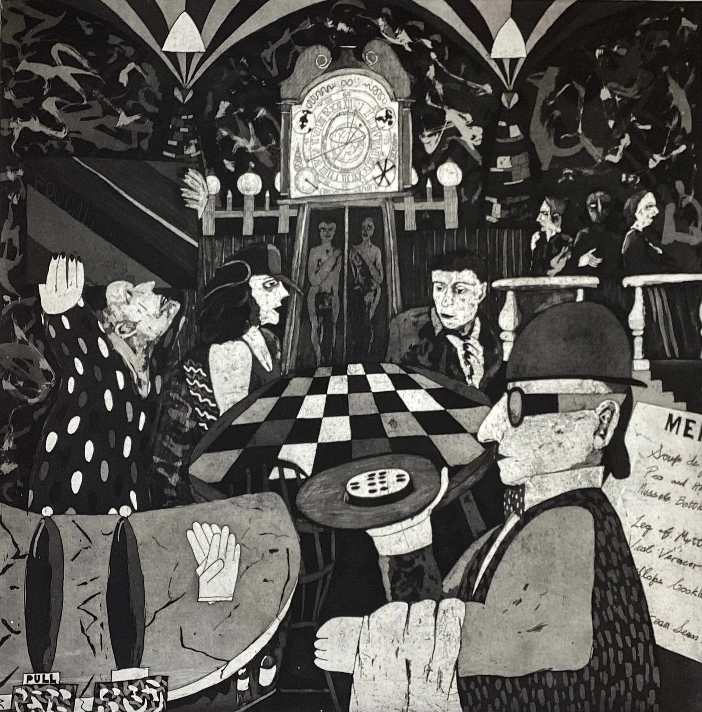
In 1980, Bob made his first impression on the Ship of Fools theme that is recurring to this day. The medieval allegory was famously used by Hieronymus Bosch in the late fifteenth century as part of an altarpiece and has been a fascination for many artists since. Bob made two large square etchings called Ship of Fools first, and two more, Study for a Triptych and Diptych slightly later in the 1980s. Other themes were also part of his 1980 opus - Games of Chance: Board Games (1980), for example - and Carousels are another, such as Group Carousel (1980).
Robert Shaw, Ship of Fools, etching and aquatint, 49.5 x 49.5cm, 1980
These 1980 prints demonstrate a coming of age. They are rich in texture and complex structure. They take the eye back and forth, up and down, across all angles as it looks at detail and then wider form, trying to establish links between characters, shapes, patterns and symbols. Meaning is with the viewer, not the artist, although the artist is intentionally and unintentionally inviting you to explore his own ‘reality’, hinting that whilst some of his constructs are fantasy, others are closely observed, and sometimes self-revealing. There are no borders between imagination and truth.
But there are images in which all of the characters could be real, others where all are fantasy, and others where the two are blended.
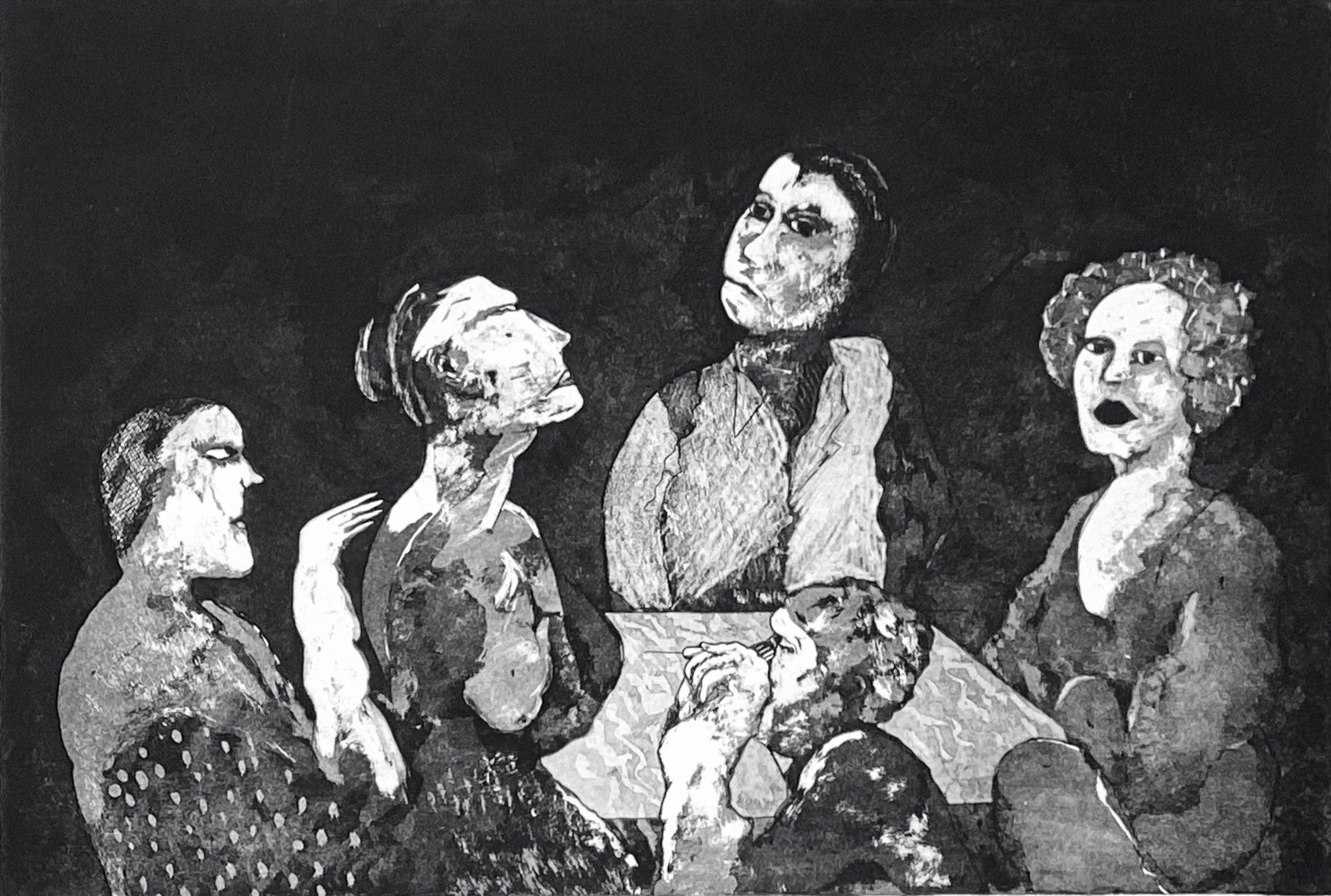
Board Games is a group portrait of five people sat around a table. They are a homogeneous group, friends who could be gathered in public or private setting. Except one of them appears to be about to jab another with a needle in her exposed breast. Shaw explores their individual personalities and shows them reacting to the circumstances and each other - or not. The crew of the Ship of Fools (1980) are seven figures who all appear to want to be somewhere else. Apart from their presence in Bob’s print, they seem to have nothing in common. Perhaps they might be seen in the same street at the same time. It’s hard to imagine the ghostly lady - who may or may not be blowing bubbles - being in the same room as anybody at any time outside a dream, but she could pass as a street theatre performer.
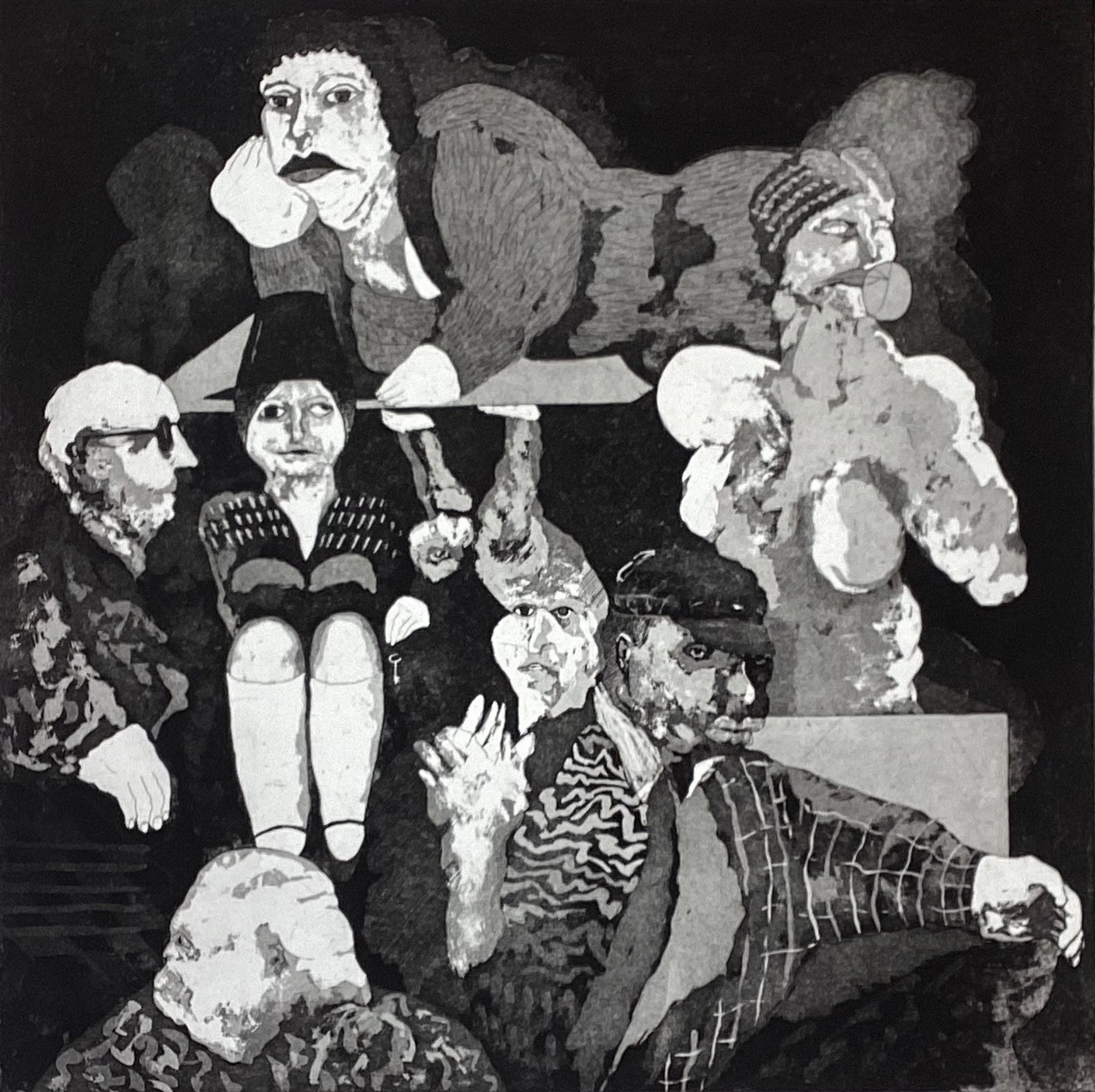
Two years later, the Ship of Fools has sailed on and in the 1982 version six individual actors, all of whom are acting separate existences, are brought together for visual effect. Just as in the 1980 Ships, they’re distant cousins to Bosch’s animated and collective group. Shaw’s shipmates don’t suggest connectivity or any form of linkage. It’s a fantasy, but as personalities they do feel real: even if they’re theatrically presented. With the exception of the short-skirted show-person, all have been given heavy white veils or masks through which mouths, noses and eyes can be seen (though the person with the cap looks through a sextant with no eyes). They’ve been ‘made-up’ to look the way they do, and asked to create differing impressions. The artist is playing; modelling each face to offer expressions that are stern, serious, vacuous, unthinking, sad, lonely, confident…
Robert Shaw, Ship of Fools, etching and aquatint, 49.5 x 49.5cm, 1982
These images were shown as part of a one-man show at Edinburgh Printmakers in May 1982. All of the prints were produced in Edinburgh, often from plates that Bob had worked on in Orkney. All are in black and white. His colleagues and friends assumed this was all he did, but at home he not only drew, he painted in colour.
“So far as my work is concerned, it has always been figurative, based in imagination. Drawing underpins all my work, whether it’s etching or painting. When etching, I start by drawing directly onto a ground plate, etching the line work, sometimes to a considerable depth, then, unless it remains a line etching, applying a sequence of aquatints which may sometimes emphasise part of the line or work over it.”
“My painting also begins with drawing, sometimes in charcoal, often with a paint stick. The drawing helps to establish a framework, a compositional base, on top of which the work can proceed, often to a conclusion which occludes and drastically alters the original drawing. These underdrawings will themselves often be inspired by drawings or parts of drawings from my sketchbooks, but I don’t transfer any sketchbook drawing directly into an etching or painting.”
“In etching I need to work directly onto the plate. I’ve come to regard aquatint as a form of painting; I visualise the tones as colour. I work in black and white because that suits my work and temperament. I have never felt the need or desire to use computer or digital methods. I have, through the years of my membership of EPW, adapted and amended my working methods to accommodate safer approaches to etching plates, in particular by experimenting with alternatives to wax ground and acid, but my preference remains to work with the traditional mordants for zinc and copper which do, to my eye, produce a distinctive result.”
The first few years of living in Orkney were prolific. The prints were bigger, conceived more expansively, and they required much more time and patience. Orkney provided a fertile environment away from the social and artistic pressures of Edinburgh. It is surely no coincidence that the move to Orkney happened at the same time as the flourishing of Bob’s mature style, with his ambitious compositions and his capacity to commit extended periods of concentration to realise them.
Robert Shaw, Self Portrait, etching and aquatint, 49.5 x 49.5cm, 1988
His energy and enthusiasm contributed, as we’ve already noted, to the establishment of Soulisquoy Printmakers, and despite his practice being to produce most of his prints in Edinburgh, he sat throughout the 1980s on the Board of Management. Amongst many other contributions, he was instrumental in bringing Alfons Bytautas to Orkney for a summer residency in 1989.
Meanwhile, his national and international exposure grew. He had a one man show at EPW and contributed to EPW’s European touring exhibition in 1982. He was part of the Scottish Arts Council’s Touring Exhibition in 1983, while his prints were shown that year at the International Print Triennale at Spa, Belgium. In 1984 and 1985 he was shown at the Mercury Gallery in London and Edinburgh. In 1987 he had his first one-man show at the Pier Arts Centre, and then another one-man exhibition at EPW in 1988, when he was also part of the Scottish Print Open touring show. The impression that he’d made in Finland presumably helped him to get an invitation to show at the Sixth Trienniale Graphica Creativa Exhibition at the Alvar Aalto Museum in 1990.
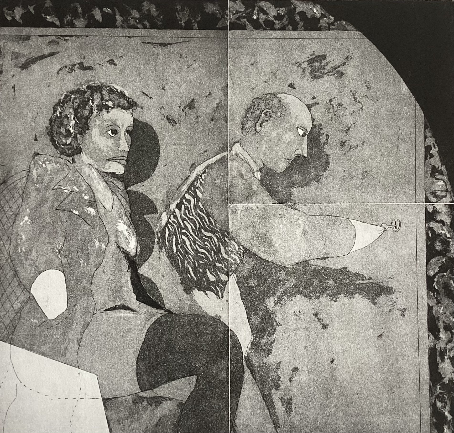
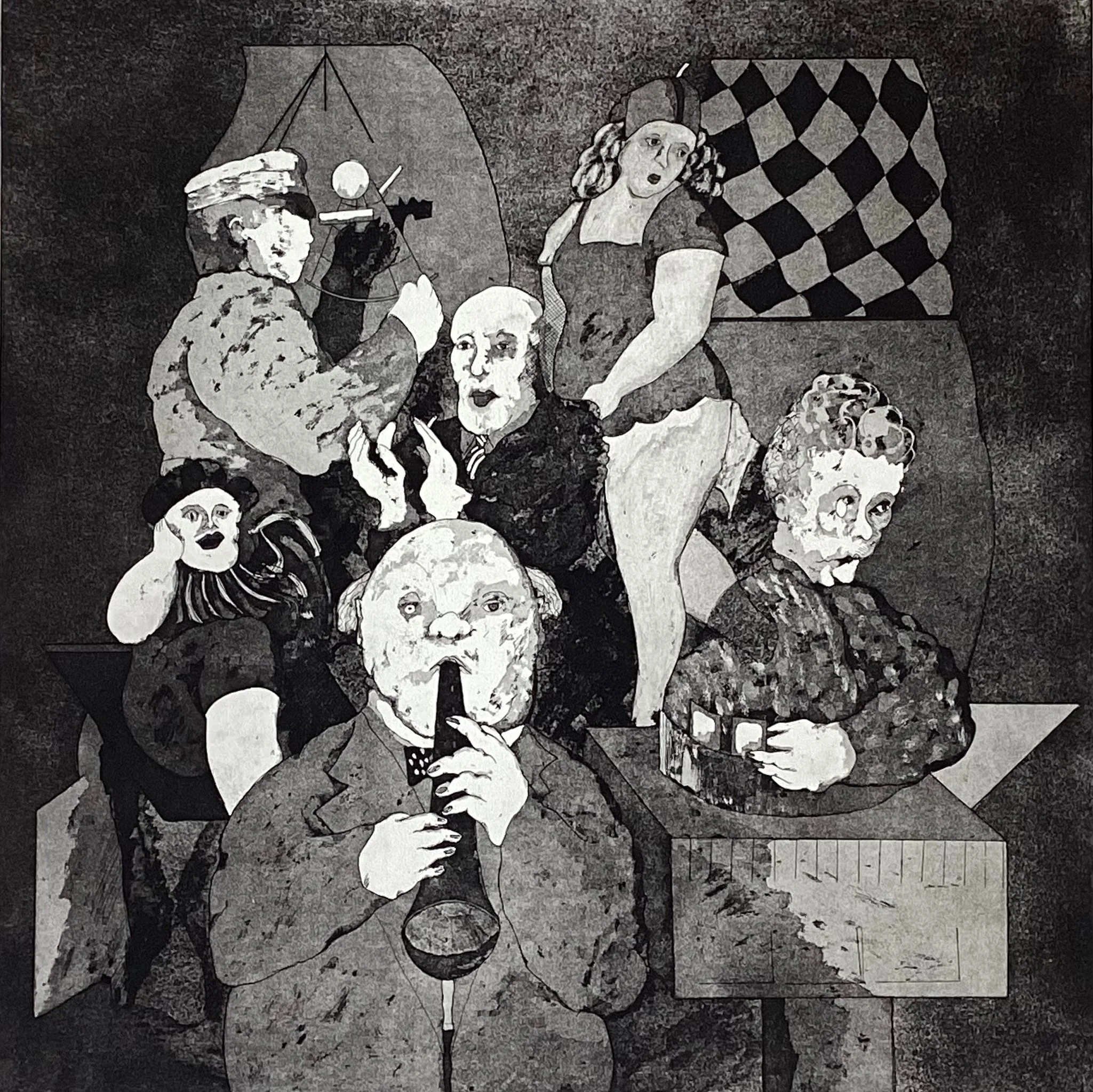
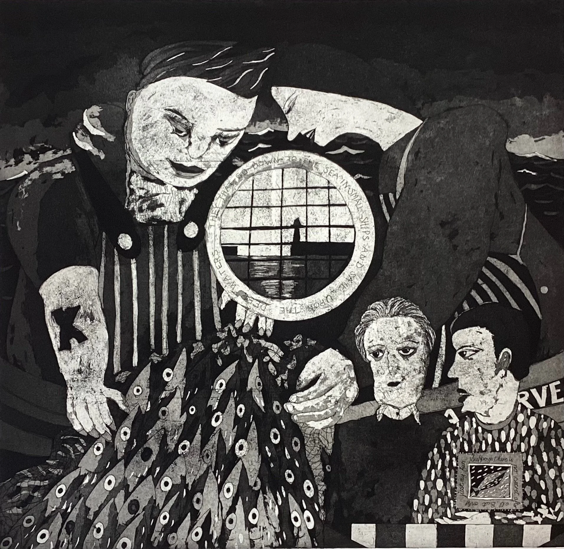
Reviewing the prints of the late 80s and early 90s, huge progress can be determined. It is clear that ten years of development in facility, and his commitment to the same medium and the same subject matter, resulted in a confidence and polish that could only be achieved by a master of his trade. Look at the clean lines, the control of shading and pattern, and the dynamism he can produce, with myriad details on a huge scale, in the tour de force that is Marking Time at the Cafe De Spencer (1991). The faces and figures in the equally brilliant Fisher Cafe (1990) show how his skills in managing detail had reached a refinement he could only grasp at ten years before. Examine the facial features and the hair styling of all four figures. And look at how the composition contrasts the two working figures handling the fish, with a wild sea motif behind them, with the two people sitting in the cafe. The detail of the collar of the female figure’s top and the big ‘tattooed X’ on the working forearm are in exquisite contrast, smooth and rough, while it’s the rough twosome who cradle the cafe couple in the overarching form, also enveloping the porthole through which a caged view of the harbour entrance with low sun can be seen. Words were becoming a regular component of the compositions and here they form a border around the porthole and the menu on the cafe table (note 5). The messaging might be a recording of an observation, and they might be one of Bob’s inner thoughts. They might also be confusions and literary plays.
Robert Shaw, Marking Time at the Cafe De Spencer, etching and aquatint, 60.5 x 60.5cm, 1991
In 1996, his status was such that the Talbot Rice Gallery in Edinburgh and the Pier Arts Centre in Stromness afforded him a joint retrospective exhibition: Human Circus. There were fifty prints at the Pier and over one hundred in Edinburgh.
By this time, Bob Shaw stood apart from nearly everyone in the Scottish art scene. A printmaker whose sole public medium was etching and aquatint, in black and white; an artist whose work almost exclusively focused on human life; and a master of an idiom that spanned over 500 years of practice and, as Duncan Macmillan noted in his catalogue introduction, had engrossed many great artists, notably Durer, Rembrandt, Hogarth, and Goya.
Bob’s work had acknowledged the presence of all of these “artist heroes” and he would replace Hogarth with Picasso in his own pantheon. It also recognised the close parallel with the Weimar years of German expressionism. However, looking at the historical precedents and then looking at Shaw’s Human Circus output, especially in the years 1980-1995, there’s no close linkage beyond medium and subject matter. Shaw’s world was (and is) his own.
Bob’s own historical references go back much further: he loves looking at illustrated manuscripts, and he talks of Icelandic legal documents and Middle Eastern medieval books.
I asked him about other influences and he says, “there are many other artists I’ve loved, including Brueghel, Campin, van der Weyden, Cranach, Stanley Spencer, Edward Burra, Alan Davie…” and he lists some artistic friends who have perhaps played a part in his development: “Ken Duffy, Alfons Bytautas, Robert Crozier, Michael McVeigh, Ivor Davies, George Donald, Roy Wood, Alan Bold…” But, despite a few resonances ( the current Burra exhibition at the Tate offers comparison), the singularity of Bob Shaw’s work is apparent.
Robert Shaw, Fisher Cafe, etching and aquatint, 58 x 60cm, 1990
Murdo MacDonald reviewed the Edinburgh Exhibition for The Scotsman: “Impressive… Ideas of mesmerism and magic abound as though nothing is as it seems. One of the ‘circuses’ or theatres of the mind that Shaw uses over and over again is the café, a place where people come to assume a part of their own devising in front of an audience of their peers. Shaw understands this and turns the café in on itself so that it becomes dramatic space of competing thoughts and intentions.”
Like nearly all commentators on Bob’s work, MacDonald made reference to his dual professions, and offered an interesting note: “the law codifies human action in ways both banal and dramatic, and it is that kind of tension that Shaw explores”.
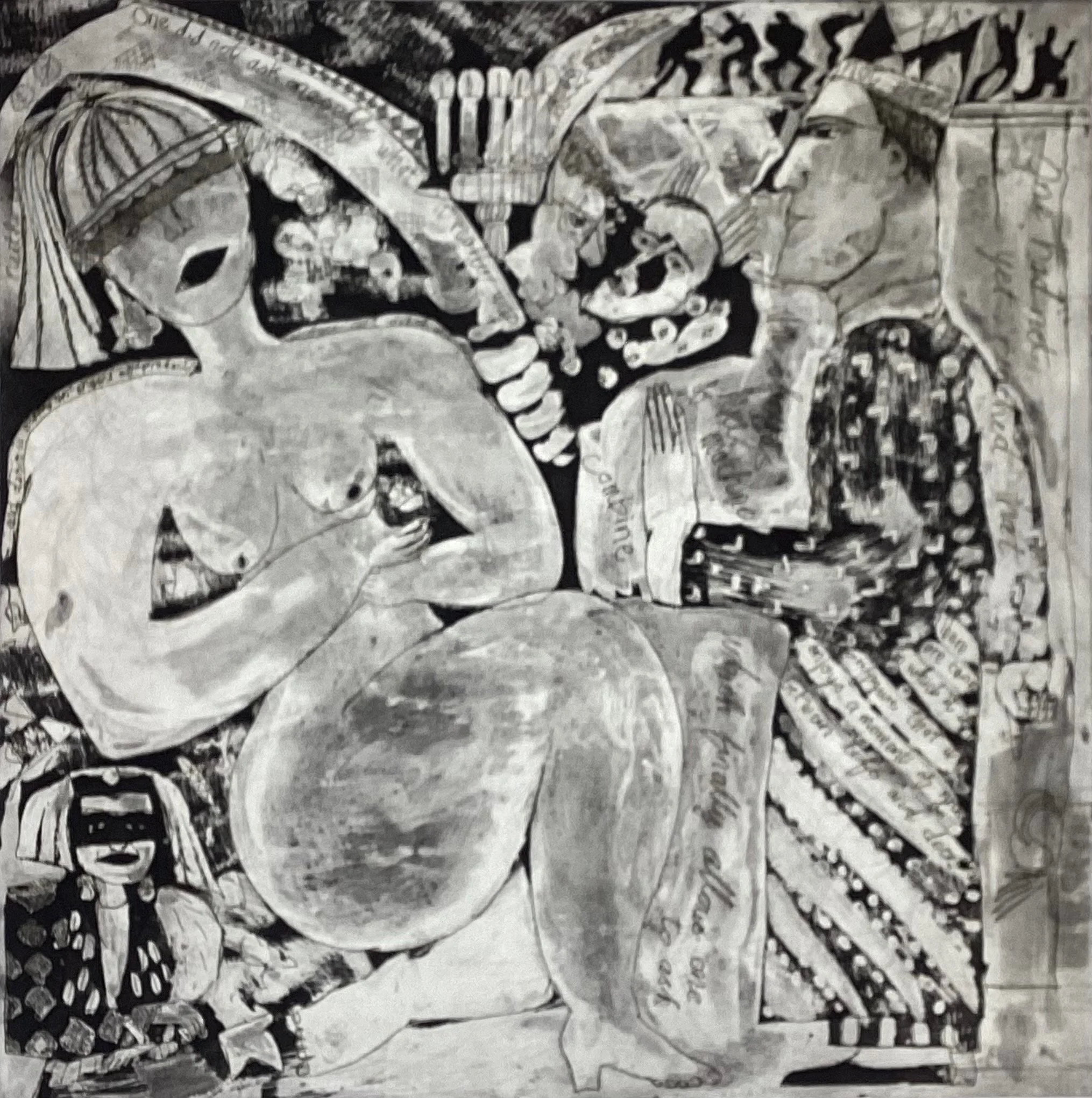
Human Circus spawned further exhibitions in Aberdeen and Inverness, but it also marked the moment when his work transitioned. The direction of travel had been away from the stark line, the flat wash backdrop, towards a complexity that embraced softer edges, multiple patterns, hieroglyphs and handwritten words. The contrast between Philosopher, Bride and Suitor of 1995 and The Fisher Cafe, produced only five years earlier, shows the trend well. While the faces of the two main protagonists, philosopher and bride, and the naked female form strike the eye strongly in the established Shaw manner, the rest of the painting is busy with pattern and detail, much of which is playful and decorative, with Bob extemporising on the subject matter with references that may or may not be significant. His freer approach created a softer, daydream-like effect, where the artist fills the image with everything that comes to mind in the moment.
The big flat blocks of ink, already much reduced by the time of Fisher Cafe, were now shrunk to bit parts in the image. Soon they would be gone altogether in much of his work.
Robert Shaw, Philosopher, Bride and Suitor, etching and aquatint, 51 x 51cm, 1995
1996 perhaps marked a change of pace and tone. Bob was 50. He’d achieved a major retrospective. He had mastered his method and he was restless. Perhaps he was concerned that further development would be restricted to refinement and polishing. The excitement of self-progress still burned strongly.
A significant change to his artistic life happened around 2000. His friend, Alfons Bytautas, was moving from his studio in Cumberland Street in Edinburgh and needed to dispose of his Rochat printing press. It had provenance. Bob had already spoken with Rochat, the press maker, by phone, and asked him if he could buy one of his presses. Rochat said, ‘yes, but do you know how heavy it is?’ Knowing he wanted it in Orkney, he asked Bob: ‘Have you got a boat strong enough to transport it?’ The boat was strong enough because it sits today in the centre of one wall in Bob’s home studio.
The press is the dominant feature on the left as you enter into a rectangular shaped room, with an angled top writing/drawing desk to its right, abutting the end wall. The wall facing you is hung with two rows of small mounted prints and paintings, mostly by Bob, but with a couple by Erlend Brown and one by Robert Crozier. Bob opens and closes the drawers of a plan chest, revealing hundreds of prints and paintings.
Remarkably, nearly all of these are unique. Bob says that he has never been interested in making editions. He works on a print, producing numerous copies, checking, reviewing, changing, and he stops when he feels he has reached the final change necessary. That will be the only print that he will make keep and make public.
In this new environment his work methods could change, and perhaps his thinking and his approach too. Instead of drawing and biting metal in one place and then inking and pressing at another time and in a faraway place, he had all the tools he needed in one small room. In a small number of cases his ambitions were too large for his own press, but mostly he could work independently, on his own; test his work as it progressed; make changes during the creative time rather than the production time, and perhaps relax a little. With the entire process coming closer to home, perhaps a domesticity, a comfort and ease, became a stronger influence. The masks slipped away; more figures seem sourced from everyday life than from the theatre. References to personal emotions seem to be more open.
Since 1996 he has continued to send work to EPW, the Glasgow Print Studio (of which he has been a long-time member and where he has had a couple of exhibitions), Peacock in Aberdeen, and The Pier, but he hasn’t maintained his exhibiting zeal. There is nearly thirty years’ worth of work in the drawers of his chest and very few people have seen it.
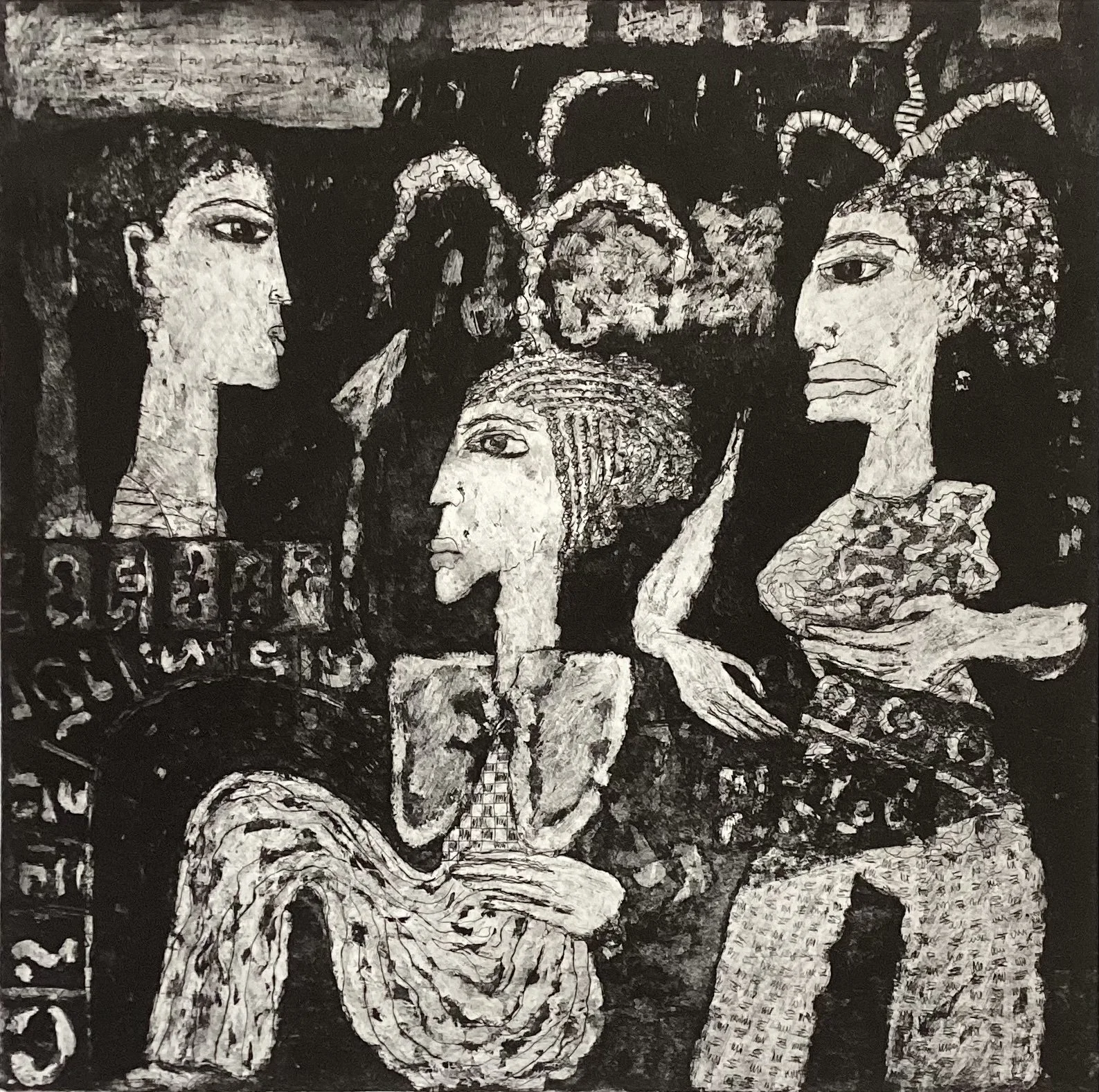
Robert Shaw, Untitled (Image A), etching and aquatint, 30 x 30cm, 2016
Robert Shaw, Untitled (Image B), etching and aquatint, 30 x 30cm, 2015
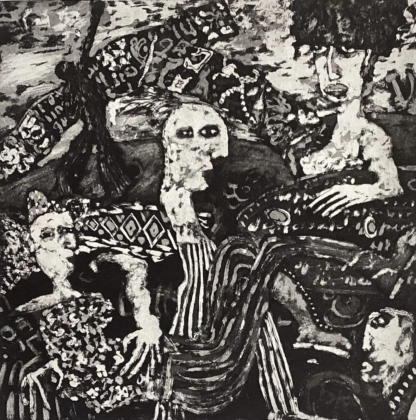
The new softness could envelope strong content and Bob has a store of images from decades of tense and difficult circumstances in the legal world (perhaps a few personally difficult moments too; I don’t know). Image A and Image B speak of anxieties and alarm, confusion and panic, bewilderment and anger. But look at the stripes and the crosses, the diamonds, dots and squiggles that give the viewer a sense of what the dizzied or frenzied humans are experiencing internally whilst looking and acting the way they do.
Perhaps these images faded with time. The view of the world became more contemplative and less concerned.
This coincided with another step toward his work becoming more personal. Bob retired as a professional lawyer in 2008, and since then his art has been his sole vocation. He still describes himself as a “retired solicitor”, suggesting that he sees his persona split and his art remaining in a more private domain.
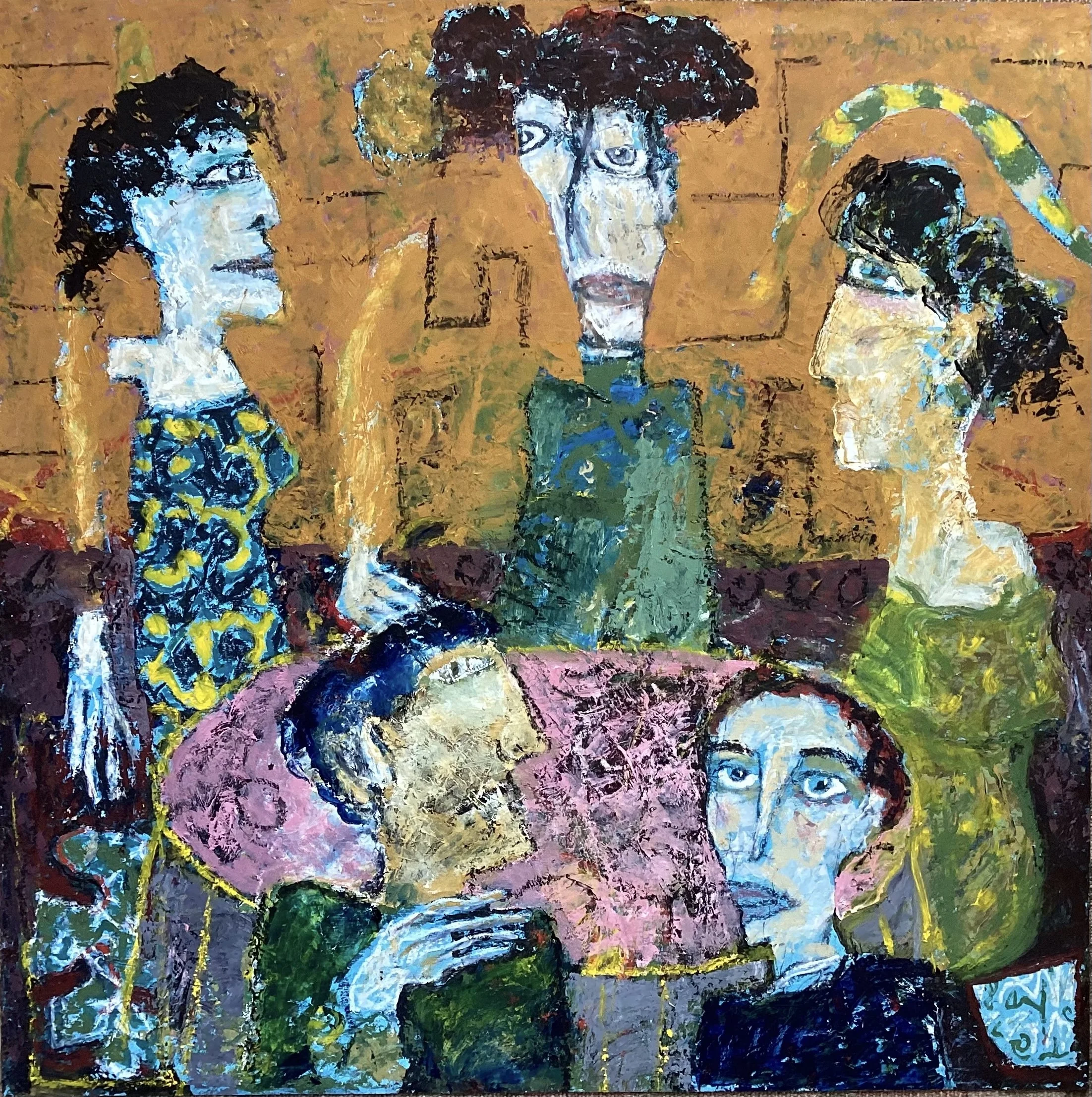
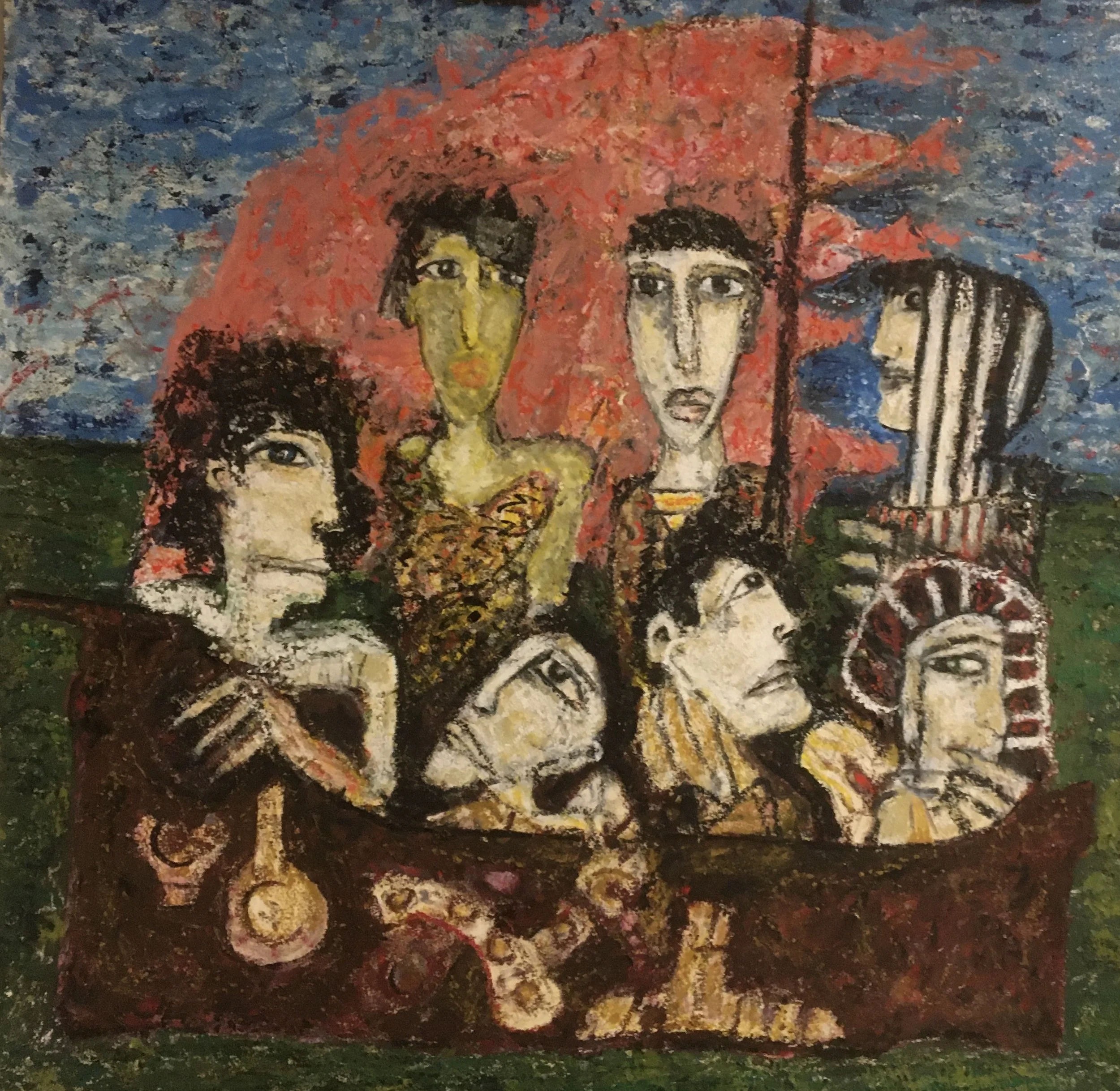
Robert Shaw, Untitled (Image C), oil on paper, 59.5 x 59.5cm, 2022
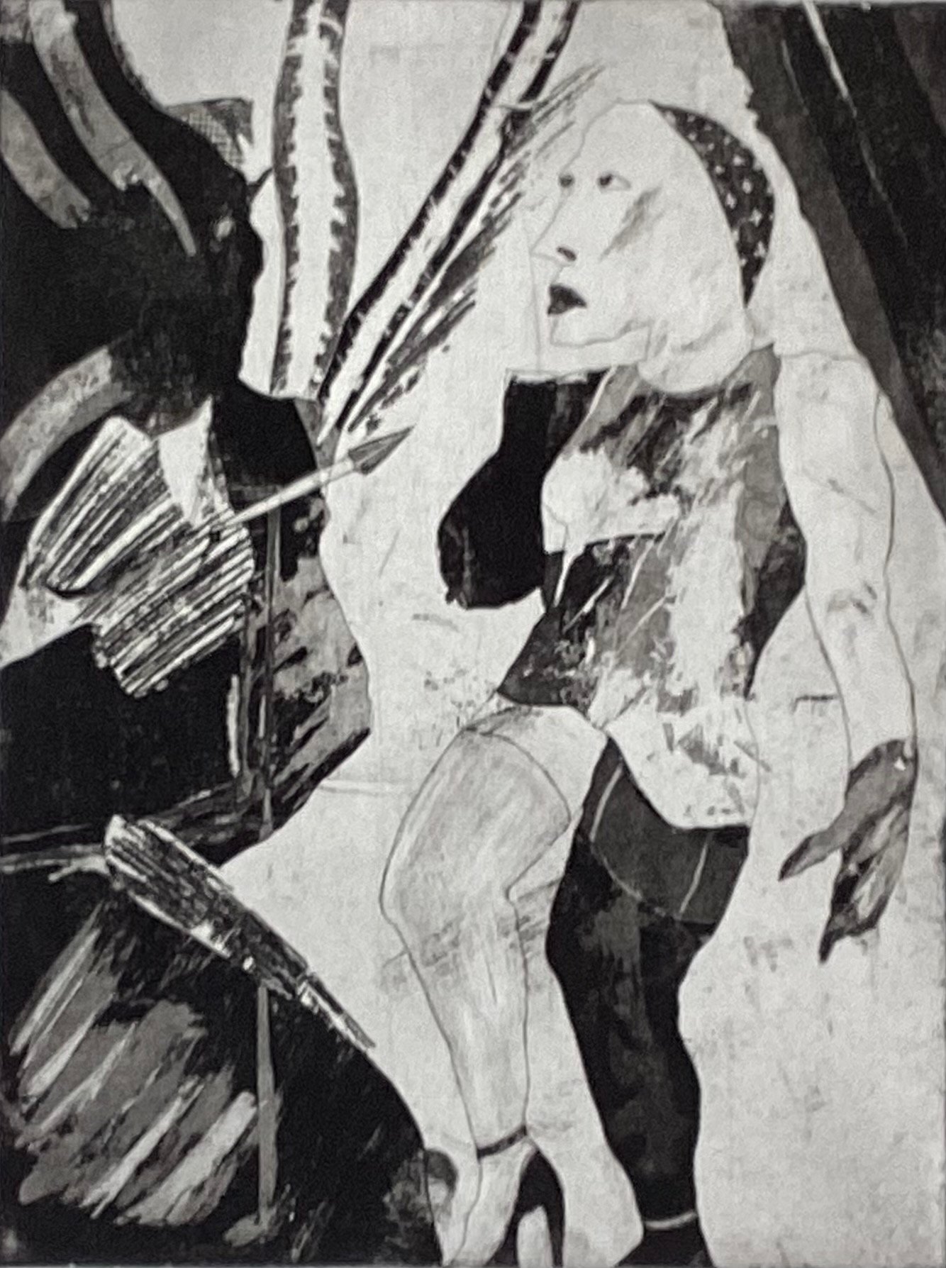
In this more personal world, he has spent a lot of time on painting (note 6), mostly on paper, and always with drawing as a starting point. His subject matter is the same as his prints: the human figure and human life. There are occasional boats. His approach is unsurprisingly the same as his prints: the distorted and disjointed forms that tell truths. There are many common links. See how Image C relates to his 1980 print, Board Games. The surprising factor is that these subtle shades of grey that were his ‘colouring’ tones turn out to be vivid colour, sometimes shockingly bright. The thrill of the new chase has taken him away from human fragility into a world of exotic expressive pattern and colour.
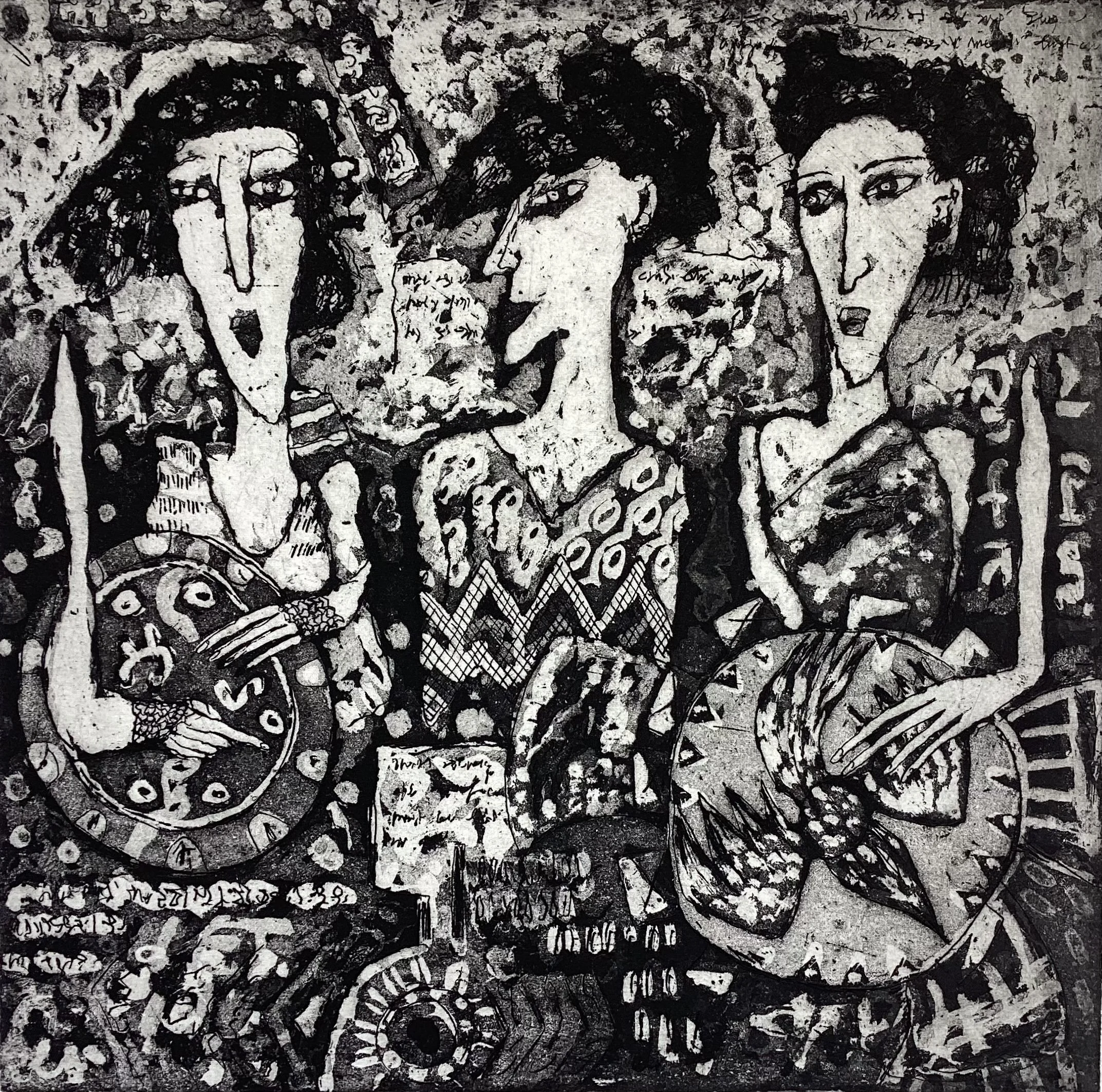
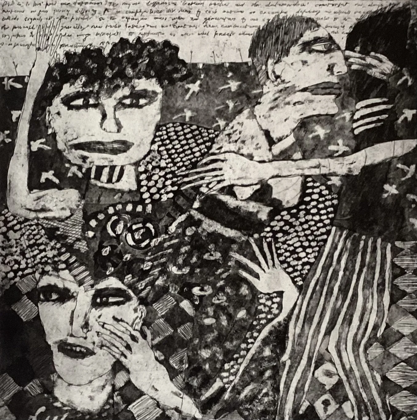
Robert Shaw, Untitled (Image D), etching and aquatint, 30 x 30.5cm, 2025

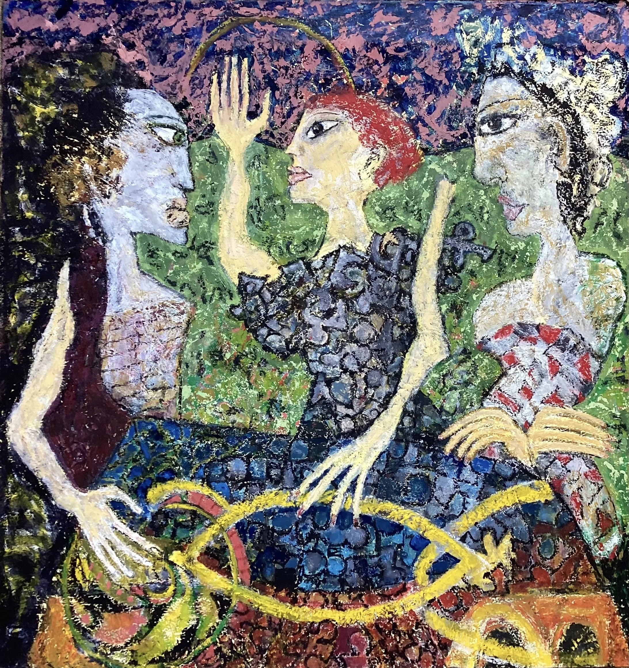
Robert Shaw, Untitled (Image E), oil on paper, 48 x 48.5cm, 2025
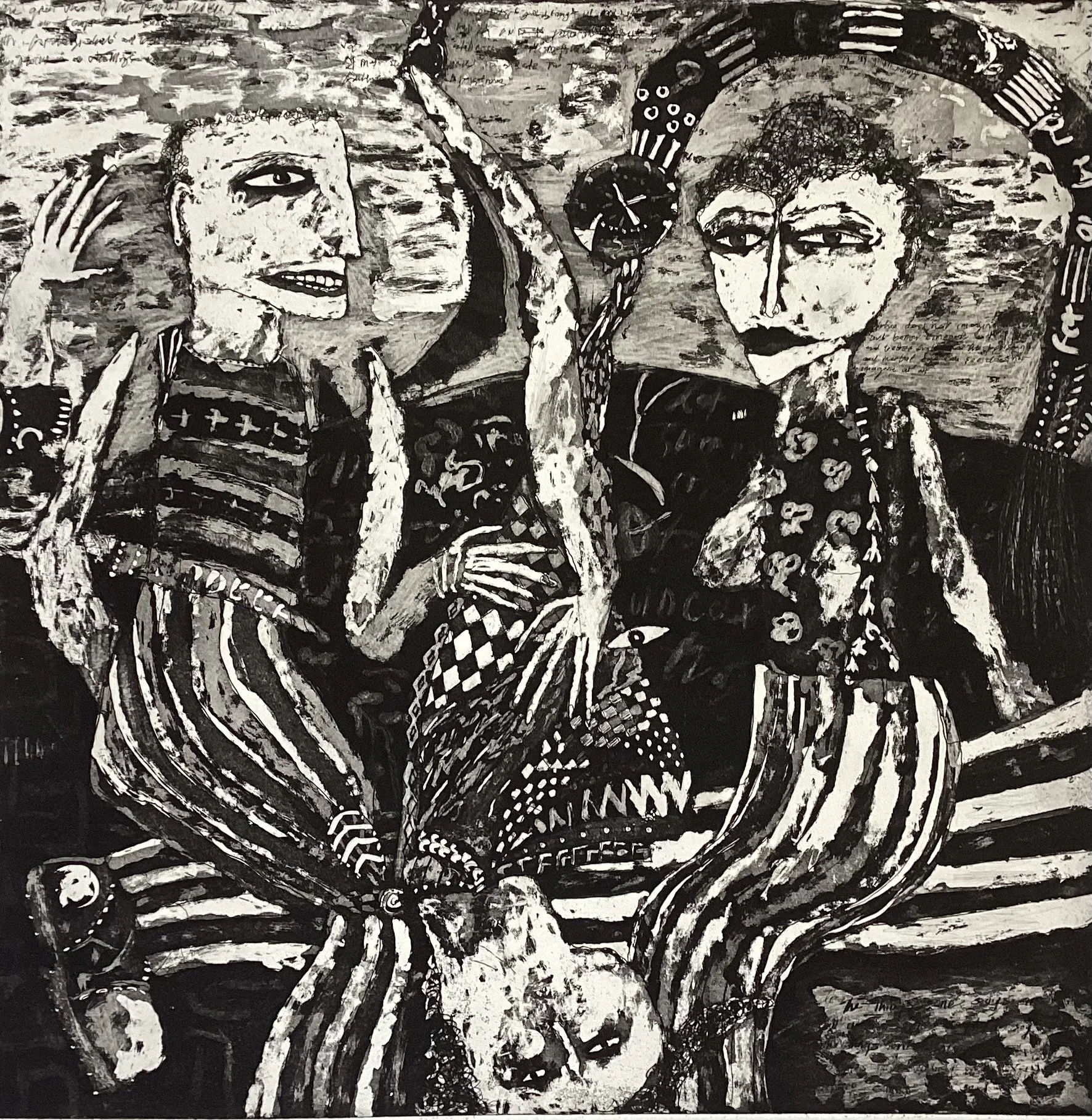
There is often a close relationship between print and paint. Take for example, Image D and Image E. In both there are three women, with two holding plates or shields: a pointing finger, dislocated limbs; well-cropped hair, and, of course, the patterning. It’s instructive to see Bob’s close affinity with a dense weave of colour in Image E and to see how he adapts this ‘loose tweed’ look into black and white.
The world of texture and weave, pattern and colour suffuses the paintings, with echoes of Bernat Klein in the bright, bold, powerful harmonies. The subjects and the motifs look less grotesque, more commonplace. The propeller from the Ship of Fools feels more like a relic in the four-figure portrait group of Image G.
Robert Shaw, Untitled (Image F), oil on paper, 60.5 x 57.5cm, 2020

Robert Shaw, Untitled (Image G), oil on paper, 61 x61cm, 2023-25
Meanwhile, through the 2000s, he was devoting more time to important work at the Pier. He feels fortunate to have known Margaret Gardiner, the founder and benefactor of the Gallery and was delighted to be elected to the Board in 2004. He became chair of the organisation and saw through the multi-million-pound development which led to the new Pier Arts Centre winning the RIAS Andrew Dolan Award for the best building in Scotland in 2007. He stood down in 2012.
The painting and printing continues. The Ship of Fools sails on, now in its umpteenth iteration, and Bob returns to it as a special reference point, a navigational tool and an anchor. Deluge: Ship of Fools is one of his latest on the subject and we can see the consistent themes and lines hold steady. So, while he continues to explore new ideas and what he sees around him now, his history stays firm: the timbers, the sails, the compositions are pretty much as he’s seen them all of his artistic life. But look at Image H: his fellow travellers suggest people that Bob might know or might have seen in an everyday setting. The personal and immediate is now a much stronger presence in his subject matter.
Today, there is more travelling, more experiences, a bigger family, and probably more engagement with the Germanic world than he had when he was formulating his artistic concepts all those years ago. Lu and Bob’s daughter, Catriona, is an established artist too (Note 7), now living in Austria, but long associated with her work in the Berlin scene of the early 2000s.

Robert Shaw, Deluge: Ship of Fools, etching and aquatint, 33 x 33cm, 2018
Bob Shaw’s lack of recent exposure means that a couple of generations have now grown up in our art world who know little, if anything, of his name or work. He eschews the world of self-promotion. There are a couple of small prints in the browsers at the Pier, but they give little indication of the wonders he holds. Very little - if anything - comes up in the second-hand market place. Why would anyone sell a good Bob Shaw?
Like all good craftsmen, he values good work for its own sake. He operates his own quality control system and his standards are set high. He judges a work finished when he realises it’s the best he can make it. He knows that his plan chest is packed with achievement. But he is unassuming about his art. And it remains a work in progress. The next picture will hopefully produce something new.
So, there we are. A printmaking master in our midst. A painter whose work has not been shown to the extent that it can be categorised, but as we can see from the few samples in this article, they are works of great power and impact. They speak quickly and directly.
Bob prints and paints now with himself as his main critic. He is committed to producing good work and to improvement and development. Next year he will be 80. Perhaps someone will celebrate that moment by enticing him to empty his plan chest and show the Scottish art world the full story.
Roger Spence
Robert Shaw, Untitled, oil on paper (destroyed), 2022
Notes:
Note 1: For those unfamiliar with Orkney, let me give you a sense of scale. If you walk along the road from Bob’s house for a few minutes you’re amongst fields with the Bay of Berstane down the hill, glinting in the sun, and Rerwick Head is clear in the near distance. Turn the other way and in the same time you can walk to St Magnus Cathedral at the heart of the town. This is where Lu and Bob have lived for forty-five years. They will know, first or second hand, the majority of the inhabitants, and be known by them too.
Note 2: Davies was curator of Talbot Rice Art Centre, University of Edinburgh, from 1971-1978.
Note 3: See the article on the Helsinki exhibition in art-scot 10.
Note 4: Later, Soulisquoy Printmakers moved to Heston, and now are part of a WASPS Studios in the Old Library in Stromness.
Note 5: Bob Can write backwards with ease, a more than useful facility in etching.
Note 6: I wonder if this is because he likes printing with traditional methods and materials, and that means he hasn’t really followed the Ken Howard-inspired move to ‘safe printing’. Does that mean toxic chemicals in the house? If so, it might encourage more painting.
Note 7: For more information on Catriona Shaw see: http://www.misslebomb.net