
John Mackechnie: Creating an Impression, Leaving a Mark
For over fifty years, John Mackechnie has been a fixture of the Scottish art scene, initially through his own pictures and then, from 1982, as Director of Glasgow Print Studio, and as a teacher and mentor to others. During decades of service, his own creative work took a back seat. It is high time we celebrated the artist and his art. Joe Boyd met him in June to learn more.
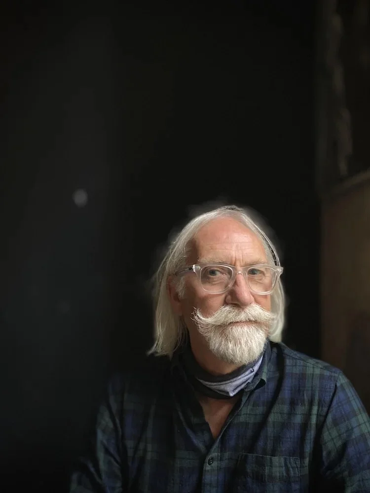
John Mackechnie, A “phone snap” portrait by David Eustace.
The first line of John Mackechnie’s statement for the Print in the Blood exhibition catalogue in 2021 states that “there’s no doubt that I am besotted with the magical world of printmaking in all its guises”. [1] I met the artist on a very sunny morning to hear more about the magic. The hot Glasgow weather was the first of my many learning experiences that day.
John is a quietly spoken man who is an engaging and thoughtful companion. Very modest about his own art, it was clear to me after hours of quality discussion that here was a master printer with exceptional skills in creating archival-quality work, mentoring other artists and developing innovative technical processes to further Scotland’s celebrated expertise in printing. I learned a great deal from John Mackechnie. Let’s begin with the art.
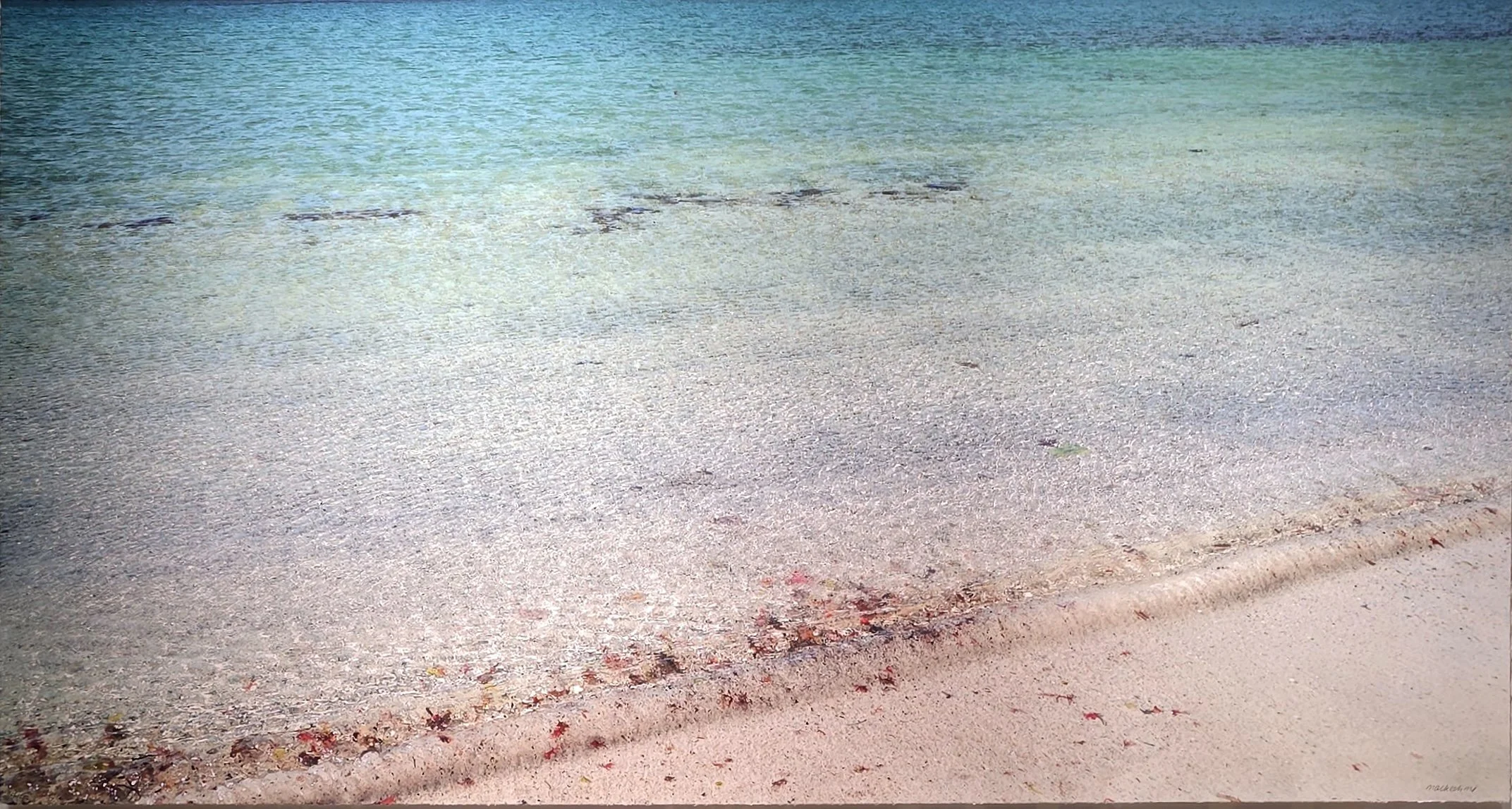
John Mackechnie, Calgary Bay, Isle of Mull. Pigment print with screen overlay. 57 × 106cm. 2020s. Courtesy of John Mackechnie.
This painterly work, Calgary Bay, Isle of Mull, is currently (July 2026) on show at the Royal Scottish Academy in Edinburgh. It is a luxuriant pigment print with screenprint overlay of Calgary Bay on the northwest coast of the Isle of Mull, and it’s big - 78 x 124 cm! Compare his image with the colours and geography of my own mapping of the bay. [2] Mackechnie’s print is granular: a distinctive feature of the real beach and of the exposed geology that confines and protects it. He has accentuated the colour differentials and tide lines at the edge of the sand, visible in the map, and included significant surface texture to enliven the water and encourage the wavelets to lap into the viewer’s consciousness. The foreshore is much warmer looking than the beaches I visited in Mull in June. The deeper bay is finely rendered in many resplendent blues. This is an image of a calm, natural place, lacking any sign of human presence.
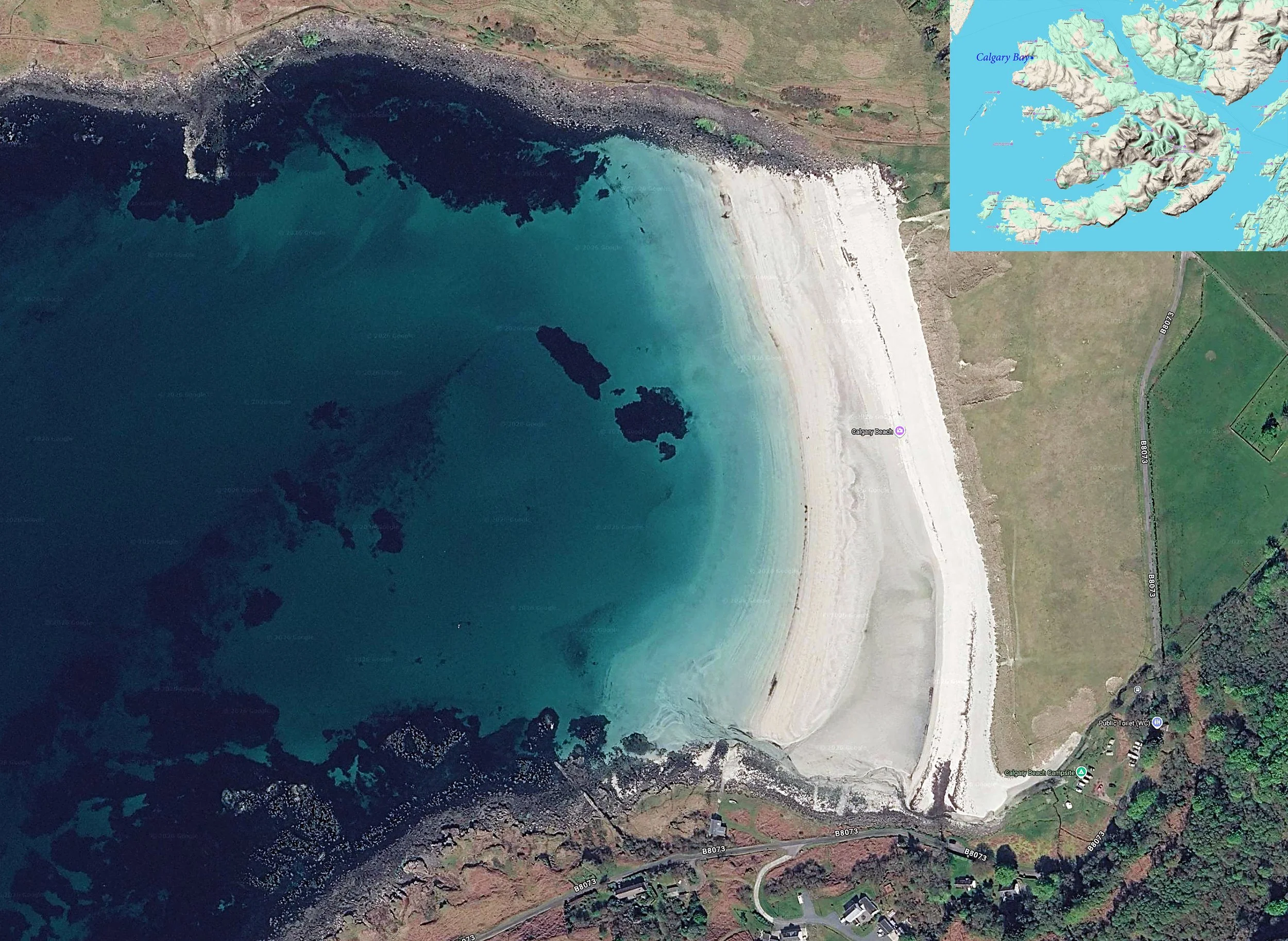
Calgary Bay mapping (Joe Boyd with QIS software).
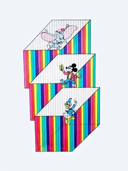
John Mackechnie, Candy Stripe Democracy. Screenprint. 40 × 24cm. 1970. Courtesy of John Mackechnie.
His early work is very different, distinctly pop-art. He has depicted the ubiquitous Disney cartoon favourites, grinning and gesturing with open-arms (or open-ears) from inside the brightly coloured bars of what might be their very own individual cages. By trapping these American icons, still in celebratory saccharine mood, inside a box, he presents a jagged, satirical view of the interaction of popular culture and democratic processes.
Mackechnie occupies a distinctive position in Scottish art, as practising artist and also as one of the country's most influential printmakers. Throughout a distinguished career, he has combined creating art with the practical, technical, and organisational skills required to advise and mentor the work of many others. His legacy extends beyond his own paintings and prints to encompass the transformation of the Glasgow Print Studio into an internationally respected centre for fine art printmaking. I was impressed and intrigued. Who was the artist behind such diverse work? What else had he created? When and where did he learn and develop his skills, this mastery of media and technique? How did he manage to give a print a texture, an impasto effect and such radiant colours? Finally, why does he do what he does? What moves and stirs and motivates him? After viewing two exhibited works in Edinburgh, my plan was to explore these questions and provide a few answers in this article.
The artist was born in Glasgow in 1949. His interest in printing developed within a family that was steeped in the Glasgow newspaper trade. “I worked in the newspaper (Sunday Express), and the reason was that my father and all my uncles all worked in the newspaper”. [3] His father was a teleprinter operator, one uncle a photographer, another a machine minder, a cousin was in the darkroom, another cousin the editor’s P.A. Mackechnie began as a copy boy aged 15, working Saturdays for the Sunday Express, and by the time he was retired at 21, he was head boy, managing a crew of teenage boys, organising shifts, and hiring and firing. The artist’s outlook and motivations were seeded early too. His father, he noted “from a very working-class family”, was creative, skilled at caricatures, and author of a cartoon strip (Mr Suburban). Son John had similar skills, and he won a silver medal at Glasgow's annual schoolchildren's art competition, one better than his dad’s own schoolboy bronze.
Post-school, he attended Glasgow School of Art where he recalls being stirred by Robert Motherwell and Franz Kline, and later by the Pop artists Andy Warhol, Eduardo Paolozzi, Roy Lichtenstein and Robert Rauschenberg. Duncan Macmillan has identified Eduardo Paolozzi as the key influence on Mackechnie's early work. [4} He began there to use photographs and screen-print them. “One of the earliest ones I did [was] a painting with Spiro Agnew and Hubert Humphreys, and it was a two-faced painting… I was never that interested in historical paintings… [nor] in cherubic babies”.
Brighton Polytechnic was next: a one-year semi-official course at the “Specialist Printing Group”. His work was advanced and interesting enough for the college to give him a job. He then took several posts at Newcastle Polytechnic, taught lithography, created and exhibited new work and, after several years, began travelling back to Glasgow, and to the recently opened Glasgow Print Studio, because he needed a studio space and relished opportunities to see his family. Part-time work there as an evening class tutor morphed into workshop manager and a permanent move to the city, and then in 1982/3 to Director of the studio. “So I've gone all the way through my career without actually having any interviews yet… [I’ve] always been kind of offered jobs.”
As Director, Mackechnie is credited with putting the studio on a sounder financial footing and energising the organisation to become a real force in Scottish art by publishing original, archive-quality prints, often in collaboration with prominent distinguished artists such as Elizabeth Blackadder, Ken Currie, Adrian Wiszniewski, Peter Howson and Bruce McLean. A skilled facilitator, he enjoyed helping others to realise the possibilities of print; for example, suggesting to Bruce McLean that he draw directly onto an etching plate with lipstick to resist the acid-etch. Such flexibility and insight are the mark of a great teacher, and he mentored emerging talents and facilitated many cross-disciplinary exchanges that enriched Scottish arts. The studio’s print editions were brought to global attention at major international art fairs: London, Chicago, New York and Los Angeles.
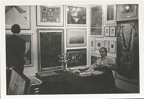
John Mackechnie at an art fair, 1985. Courtesy of Glasgow Print Studio.
Mackechnie’s enthusiasm shines through his descriptions of this missionary work. “I did this art fair in 1985 in Olympia, London, A big international art fair, and just drove a van down; me, the chairman and my wife, Sue. It was winter. It was January. On the way down, the van engine blew up… and so we had to get hauled to Lancaster and hire another van, transfer all the stuff. Got down there to find that the stand hadn't been built yet. A tiny, tiny little stand, but we'd one major work, which people knew, which was a big Bruce McLean that we were commissioned to make by the Third Eye Centre… But anyway, it was quite successful”.
Quite successful indeed. As painter and printer, his early work had focussed on 1960s and 70s cultural influences from the USA and UK. From 1982/3 until 2000, he set his own work aside in order to inspire and lead that Glasgow institution to develop its international reputation. His contribution to Scottish art has been formally recognised by his election to the Royal Scottish Academy in 2003 and by an MBE in 2019. He retired in April 2023.
Several places have been vital to Mackechnie’s story. His father’s father hailed from Mull and his mother’s family from Lewis, an island heritage that roots him in Scotland, near the seas which are never more than 45 miles away. An Lanntair gallery in Stornoway on Lewis recently hosted his solo exhibition of “beautiful, striking images which feature a number of beach and seascapes from the west coast and the islands, and have a depth and an extraordinary visual resonance”. [5] Glasgow is now the consistent anchor for his life and career: “I do love the city of Glasgow”. This evident affection has been translated into particular artworks: the 1970s etchings of the Clyde and of Kibble Palace in the Botanic Gardens, [6] a riverside screenprint of the Moat House hotel, and a reflective study of a building at Finnieston. In 2018, Glasgow Print Studio presented Glasgow in Print, an exhibition of informal reflections on the city. As Director and exhibitor, Mackechnie described it as a snapshot, an illustration of “the amazing breadth of quality and the confidence we should have in the future of printmaking in Scotland”. He is wary of anything that echoes the chocolate-box picturesque interpretations that have distorted the public face of Scotland.
Just as place is a necessary and definitive constituent of an artist's identity, so too is place a necessary and definitive constituent of an artwork’s identity. Mackechnie has utilised many Scottish coastal and island locations for his land and seascape works. Arisaig is paramount, with accessible, varied, sheltered beaches. Arran, photographed from the ferry, and a misty, stormy Isle of Rhum are among his favourite images. There are also renderings of the river Clyde, and Ailsa Craig and the Bass Rock were the subjects of Payne's-grey monochrome images, a new departure referencing early gouache images made in Skye while still a student. The sea is extraordinarily detailed.
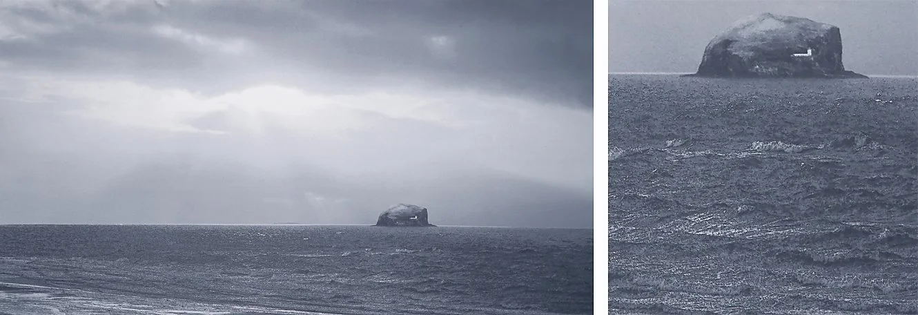
John Mackechnie, The Bass Rock, Medium unknown. 57 × 106cm. 2024. Detail on the right hand side. Courtesy of John Mackechnie.
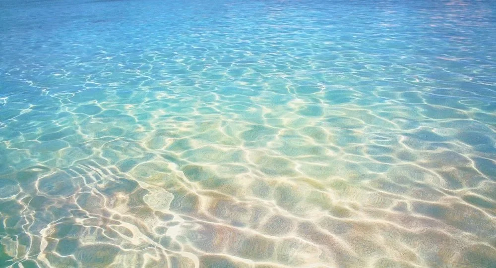
John Mackechnie, Cala Macarella. Screenprint. 57 × 106cm, 2020. Courtesy of John Mackechnie.
Further afield, Mackechnie’s prints include Spanish beaches of warmer colours, and his earliest series of a dozen water images from Venice and Ljubljana, alongside American and Scottish locations. Brighton and Newcastle were important places too because he experimented with novel techniques, learning at Brighton to create three and four colour etchings from photographs; technically very difficult. He also learned at Newcastle how to use polished steel rather than zinc as the etching medium because steel does not discolour the ink and does not wear down as readily.
The United States was the other significant place in his artistic geography. In 1982, he undertook a five-week photographic tour, partly in homage to crime fiction writers: “I always loved Damon Runyon’s short stories”. He focussed on the urban landscape, on architecture and mood. On his return, he crafted etchings from these photographs and was taken on by New York art dealer, Karen McCready. Memories of New York later resulted in a homage to 9/11 and the Twin Towers: his print Monument. In 2003, he retraced the 1982 route through New York, Chicago, and San Francisco over three weeks, which provided images for a photographic “crossroads” project. Duncan Macmillan describes how the techniques had changed but “the iconography is similar - in Valiant he even found the same car still parked in the same garage”. [7] The connections with the USA have strengthened because his daughter and family now live in Carlisle, Massachusetts. An exhibition in the nearby historic town, Concord, in September 2026 will include his water-image work for the first time alongside the urban landscapes.
Mackechnie’s work is diverse and extensive. He has created paintings, etchings, screenprints in monochrome and colour, first with a few and later with 30 or more colour screens. He has experimented with and pioneered new printing methods and the use of technology. A few examples will indicate its quality and range.
He remembered at school creating a set of screenprinted cotton placemats, printing his own designs with cut-out stencils, using profilm that was ironed onto the screen. There was a stylised flower design that was very much of its time. At art college, he experimented with screenprinting on to his own paintings and later, at Brighton, with lithographs and etchings. A mouth motif was a favourite there.
“Earlier work predominantly used etching as my medium of choice, developing new techniques... I found that by transferring photographs onto etching plates, I had a degree of manipulation that was not possible in photography until the development of Photoshop. Added to this, the surface quality of etchings and the richness of colour that could be attained made the whole process very seductive”. [8]
He was fascinated with solving technically difficult problems, and he developed and enhanced new techniques such as multi-plate colour etching. Essentially Mackechnie was applying two quite different working philosophies to two different media: calculated foresight for etching, improvisation for screenprinting.
This multi-plate colour etching was included as part of an Arts Council–funded publication on the theme “Rite of Spring”. It portrays his wife, artist Sue Mackechnie, standing outside an art deco house in Jesmond, Newcastle.
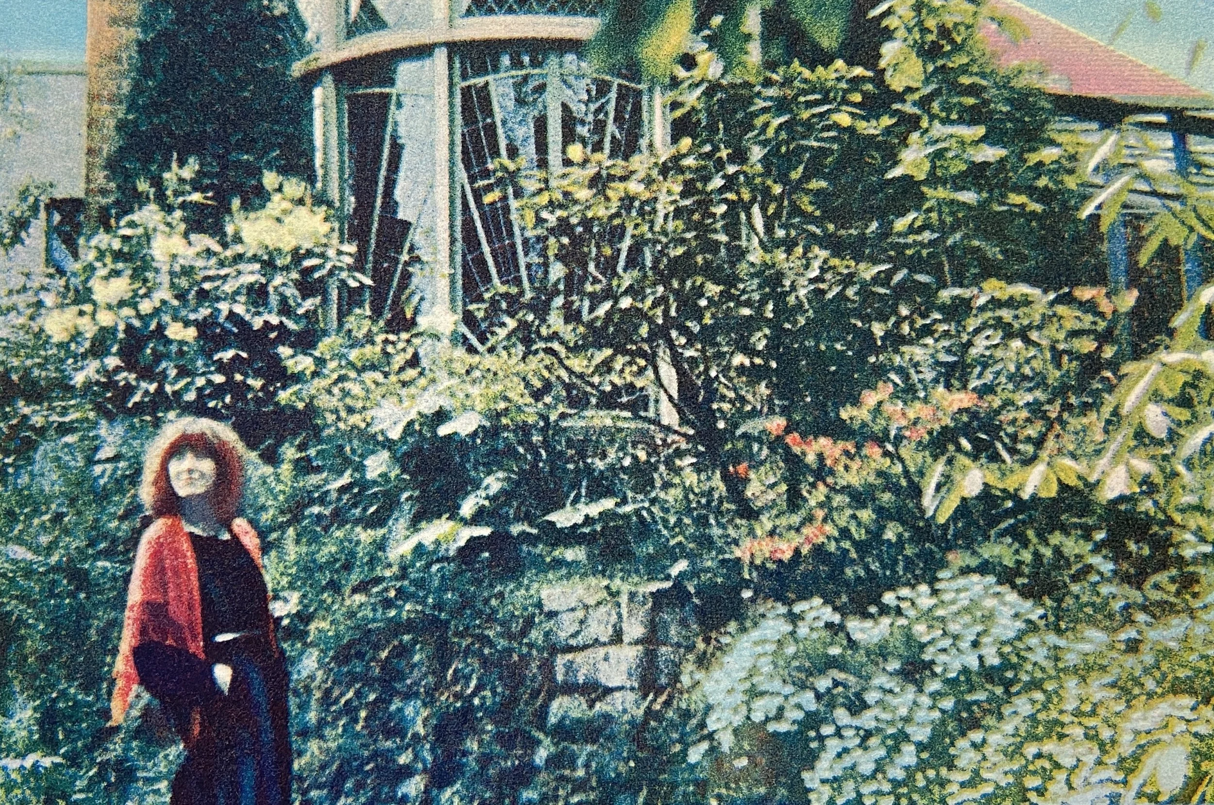
John Mackechnie, Rite of Spring. Colour etching. 50 × 66cm. 1977. NHS Lothian Charity – Tonic Collection. Courtesy of John Mackechnie.
The multicoloured image is precisely aligned. The lady in red contrasts with the profusion of foliage, the greenery spreading to frame the geometry of the local architecture. Mackechnie frequently used buildings to experiment with light and graphical alignment.
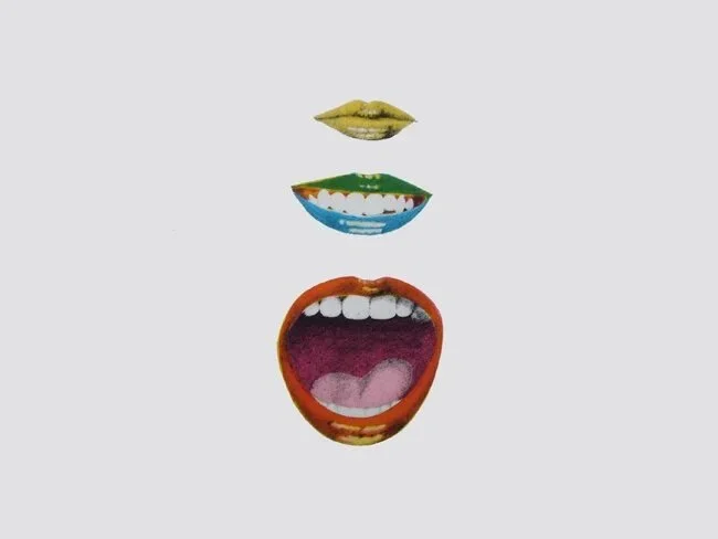
John Mackechnie, Mouth Series 1. Lithograph. 64 × 43cm. 1972. Courtesy of John Mackechnie.
He also favoured a mouth motif. It appears widely on lithographs, drawings and small paintings, and in a group poster of other students at Brighton. “I represented all of them by having a photograph of their mouths in a collective, like a dozen mouths. It was certainly before the Stones used it”. (The Rolling Stones' famous tongue and lips logo.)
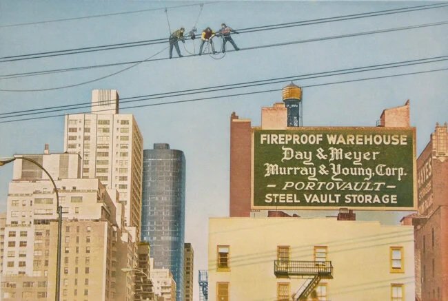
John Mackechnie, New York Scenario. Etching. 56 × 71cm. 1980s. © John Mackechnie
Structures and geometry were important too. This urban landscape echoes the celebrated photograph of construction workers on a girder high above the site of the Rockefeller Centre. [9] To create this etching, Mackechnie used a different plate for different colours, and his registration had to be meticulous to construct such a sharp, bold, vivid cityscape. His experimental methodology was unusual and influential, and there was a landmark exhibition in 1984 to illustrate his ‘Etching, Glasgow style’. [10]
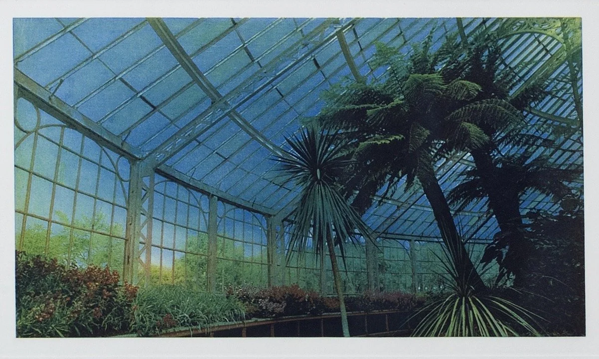
John Mackechnie, Winter Garden-Arcology. Colour etching on paper. 53 × 71cm. 1980. Aberdeen Art Gallery. Courtesy of John Mackechnie.
This is a colour etching of a scene in Kibble Palace. The geometric iron skeleton of the Victorian building, and the blue hazing that the artist has accentuated, contrasts with the dark green, almost black, natural pillars of the plant trunks. The Kibble Palace/Winter Gardens series of etchings were exhibited to strong reviews at the Thumb Gallery, Soho, London.
The next image is a composite from Mackechnie’s website to illustrate the variety and depth of his work. It displays his fascination with structure and with sprawling American cars, and exemplifies his mastery. The top two rows are multi-take screenprints; the bottom two rows are Iris prints progressed from high-resolution photographs taken with a large-format camera. There are several key themes to identify within this image: structures, reflections, American Beauty, and film noir. These seep and fold into one another at times.
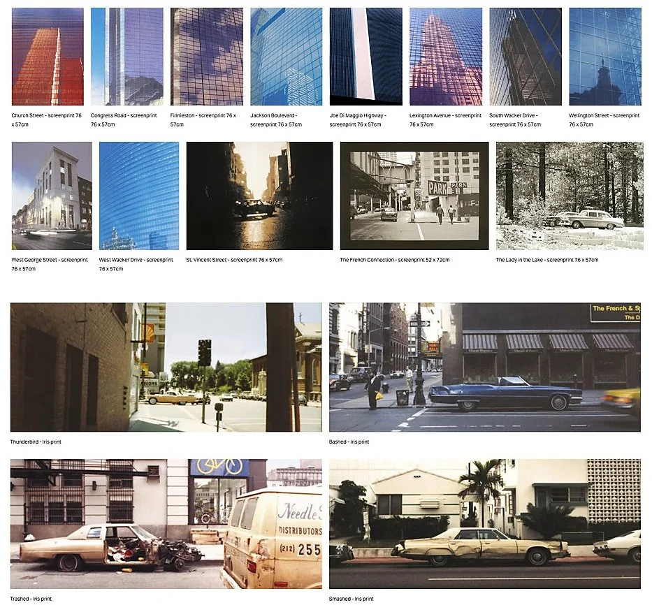
John Mackechnie, key themes from the 1990s. Courtesy of John Mackechnie.
Shortly after becoming Director of the Print Studio, Mackechnie stepped away from making his own work. From 1983, he managed, led and grew the organisation whilst teaching and collaborating with other artists in an authoritative publishing programme. “Over five decades, thousands of artists have made prints at GPS, from Turner Prize winners and nominees to recent graduates and complete beginners”.
“So that's when I put forward that we should have a publishing programme where we invite artists that we know are successful to come in, and that's when a call went out to Elizabeth Blackadder, John Houston, Peter Howson, and Adrian Wiszniewski, a whole pile of artists, Bruce McLean. We started working with those people, and then we end up with a kind of a catalogue of really high-quality works.”
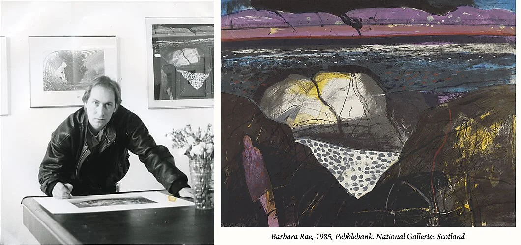
Left: John Mackechnie signing a print.
Right: Barbara Rae, Pebblebank. Lithograph on paper. Dimensions Unknown. 1985.
This photograph shows Mackechnie signing one of his own prints. The wall behind him displays one of his works plus the Barbara Rae lithograph, Pebblebank, which was published by the Print Studio in 1985.
These collaborative projects are a crucial part of his professional legacy. [11] They included the portfolio of orchid etchings and a further portfolio of cat etchings made with Elizabeth Blackadder, part of an ongoing collaboration of more than 100 editions created with her over the latter part of her working life; the large woodcut (about six feet by four feet) by Peter Howson, part of a friendly rivalry of scale with Adrian Wiszniewski, who subsequently produced an even larger woodcut of his own; a major early commissioned work by Bruce McLean for the Third Eye Centre, shown to strong response at the 1985 London Art Fair, and a body of monotypes and a large (roughly three by four feet) etching with the same artist, notable for McLean's improvised performative working method that included applying household Brasso to the Perspex matrix; etching plates and prints associated with John Bellany, including older plates, some originally etched by Anthony Kirk, inherited into the GPS archive, and three new etchings Bellany made in person at the studio around 1993.
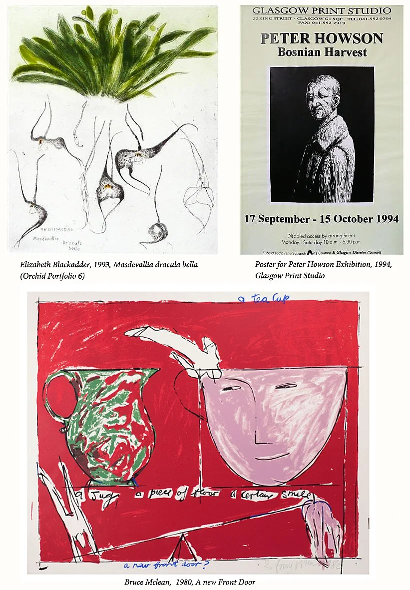
Samples of Collaboration. The exhibition poster features the Peter Howson woodcut Suspicious Boy, which was printed in black and yellow-green ink. Courtesy of Glasgow Print Studio.
After 1998, Mackechnie returned to more individual, personal work. Some was retrospective, much was very innovative. Notable examples include: monochrome screen prints made in 1989 from photographic negatives shot in the mid-1980s, black and white intended partly to “set them in the past”; a set of six Iris prints (pre desktop-digital technology), printed by an external bureau onto handmade Somerset paper and shown as part of the 1999 Urban Myths exhibition; an ongoing urban-landscape series based substantially on photographs from earlier USA trips, focussing on tall buildings, reflections, and American cars. He described this as “unfinished business”, and he continues to produce new paintings in this vein; at least two prints depicting the Twin Towers, made before 2001.
He repurposed one of these images in response to the atrocity at the World Trade Centre, a screenprint titled Monument.
“I felt very connected to the World Trade Centre, and so then it came down, and I did a kind of tribute one, which is called Monument. I took all the speeches of George Bush, and completely overprinted this image of the World Trade Centre, again one I used before, with his speeches… The World Trade Centre; it sat on a kind of base, so I did a black bit in the bottom base, and I ‘kind of’ printed a bit of the text that summed up the situation at the time on the bottom.”
The two blues, pink, black and grey inks meld together, and there is an illusion of movement. It was shown exactly one month after 9/11 and later acquired by the Metropolitan Museum of Art, New York. The atrocity functioned as a creative catalyst, not as a subject to be depicted directly but as an experience of watching a global shock from a physical distance that left him thinking, quite literally, about ripples and reflections. And that is the visual and thematic language that his water series has used ever since.
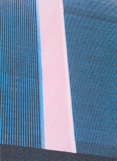
John Mackechnie, Monument, 2001. Screenprint. 72 × 52cm. 2001. Courtesy of John Mackechnie.
Mackechnie has since moved decisively beyond revisiting old ground into genuinely new territory, which Duncan Macmillan judged, in 2010, to be his strongest work. Mackechnie explained that he must find the “right” images to transform into prints. A digital series of 12 water images, without shoreline or horizon, drawn from foreshore locations including Venice, Ljubljana, the United States and Scotland, was another stimulus for his ongoing “just water” screenprints. These recent prints are titled to preserve some ambiguity in location. Examples include Macarella (Spain); a storm image referencing a location near Dunure; paired Payne's-grey images of Ailsa Craig and Bass Rock; a view of the Isle of Arran from the ferry; a misty Isle of Rum storm image.
“So many things have to come together to get something that grabs me. Sunshine really helps and so too does a high tide, as does the position of the sun so as not to cast a shadow of oneself, and of course, the wind that disturbs the surface of the water in ways that are rarely what I am hoping for. It could take several trips to find one image that I can use.”
This was a richer indication of the importance of place in his work. Place is a “persistent sameness and unity, which allows that [place] to be differentiated from others”. [12] And a place’s identity is determined by its physical setting but also by the experiences, persons, actions, cultural meanings, and so on, that are associated with it. For Mackechnie, “where” is more than a simple list of locations. Preparing an exhibition in Lewis, “I was up there twice last year. I was struggling to get a photo that I liked. It was just too pretty. So I did one which made me think more of Bet Low, Glasgow artist. It was more sand than sea, and so I did this one screenprint of the sand and sea and called it “Luskentyre”. Elsewhere, he mentions the purity of the water, the shell-covered beaches and multicoloured seaweed “that I have grown to love”. [13]
To discover what he considered important, I asked him to (roughly) rate the importance of various aspects of place for his compositions, on a scale of 1-10 where 10 is most important. That conversation is summarised in the table below. [14]
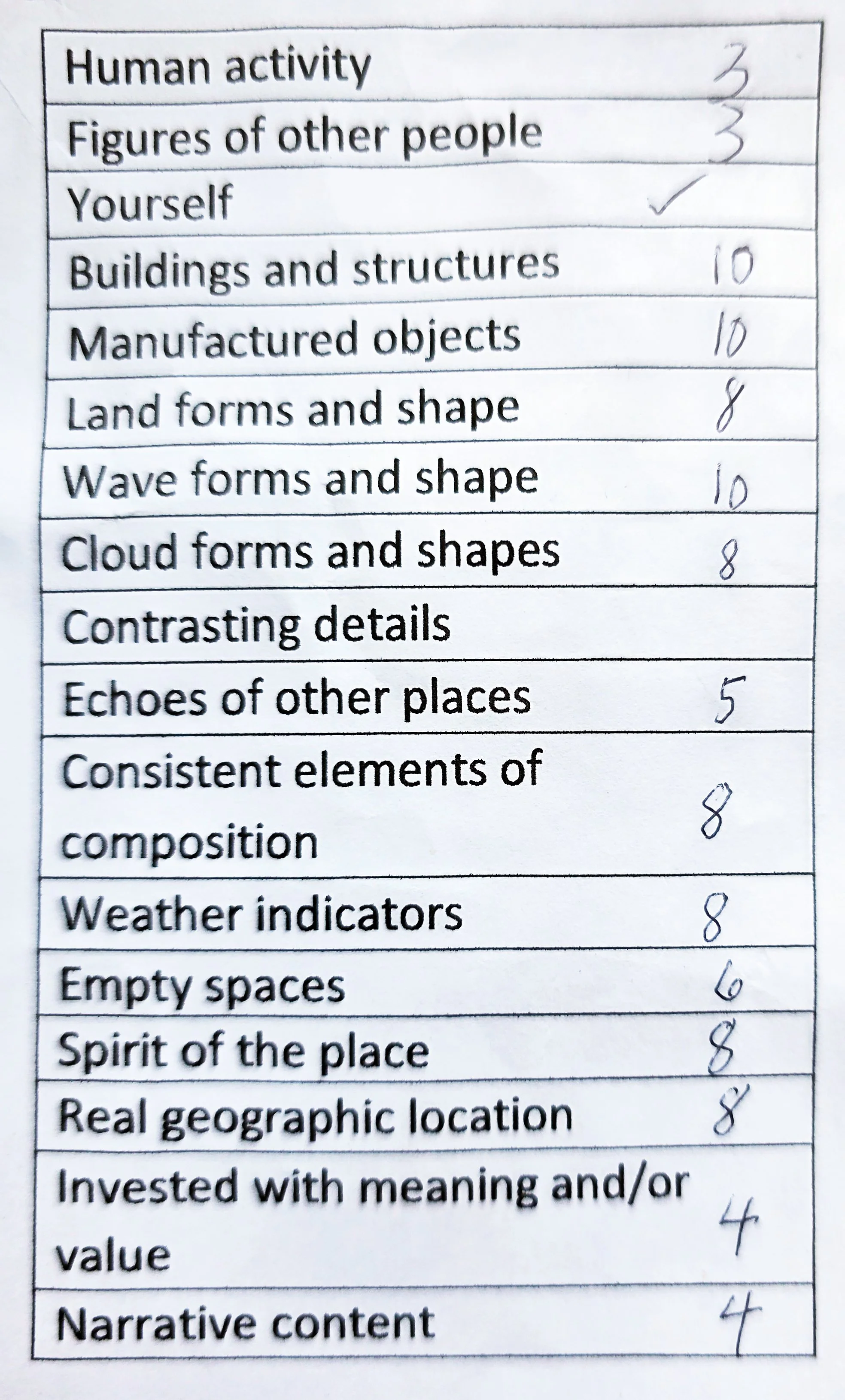
Table: the relative importance of different aspects of place in Mackechnie’s compositions.
He favours explicit conditions of place: sunshine, a high tide, light that avoids casting a shadow, and little wind, since wind disturbs the water's surface. It can take several trips to take one suitable image. Hence, geography is a critical factor in Mackechnie’s art.
The recent water prints have revealed his mastery of depicting the shimmer of light and shadow that water causes as it moves. His is an art of “light, pattern and reflection, the translucence of the water and the power of the sea but without shoreline or horizon, sometimes quite abstract and sometimes as if you could walk right in, the movement frozen in one instant of time.” [15]
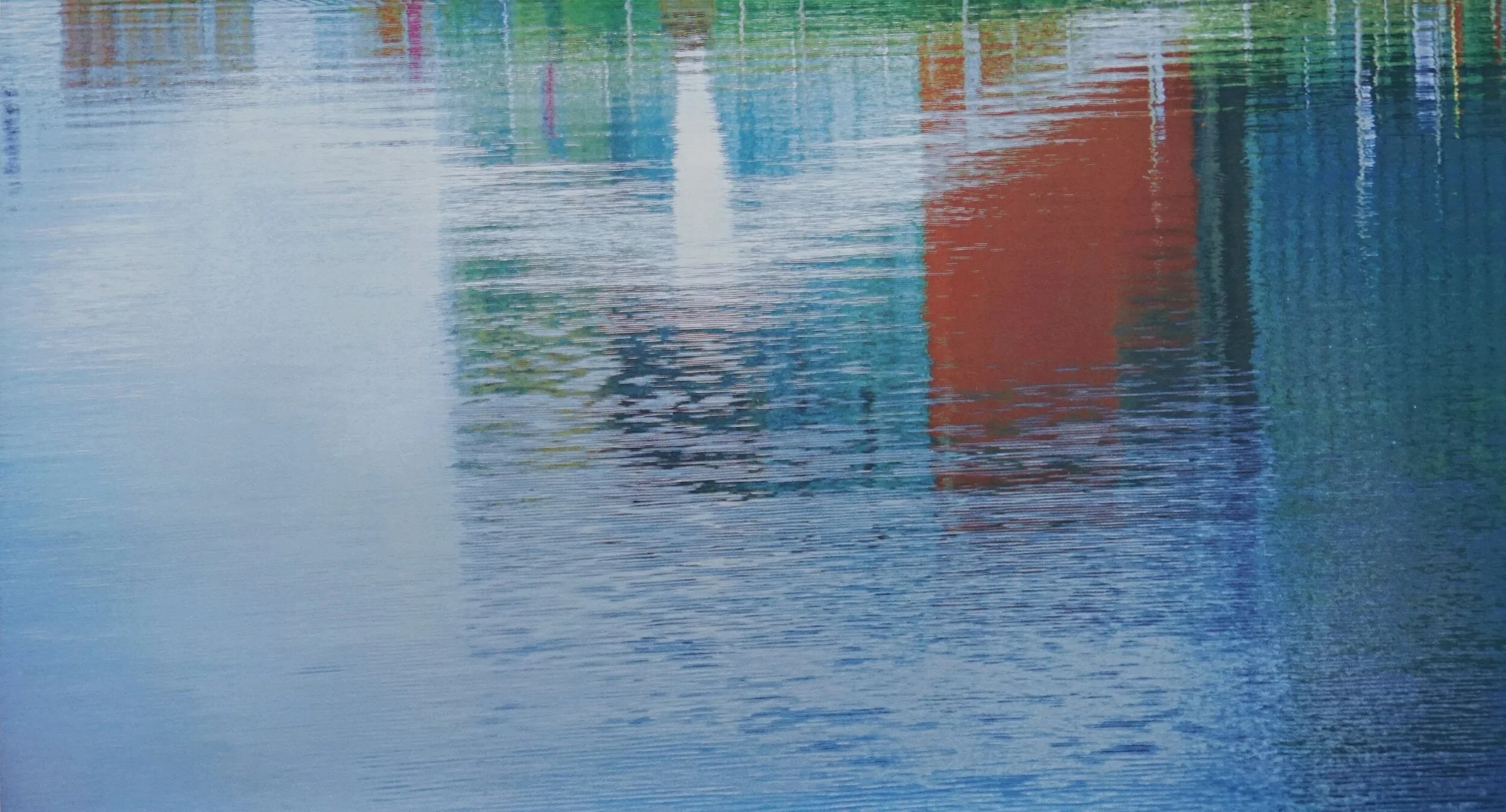
John Mackechnie, River City. 2010s. Screenprint. 57 × 106cm. 2010s. Courtesy of John Mackechnie.
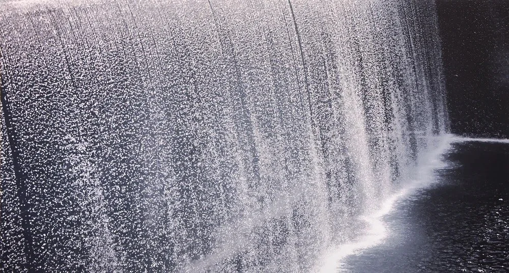
This river water is deep and atmospheric. The reflected red rhomboid block and white chevron beguile a viewer into wanting to see the real structures. This next print is full of movement and visual noise. For me, it conjures up the energetic rush and thunderous noise of high water in spate, rushing and tumbling over a weir to paint the lower pool in foam. It is however based on an image of the 9/11 memorial in New York.
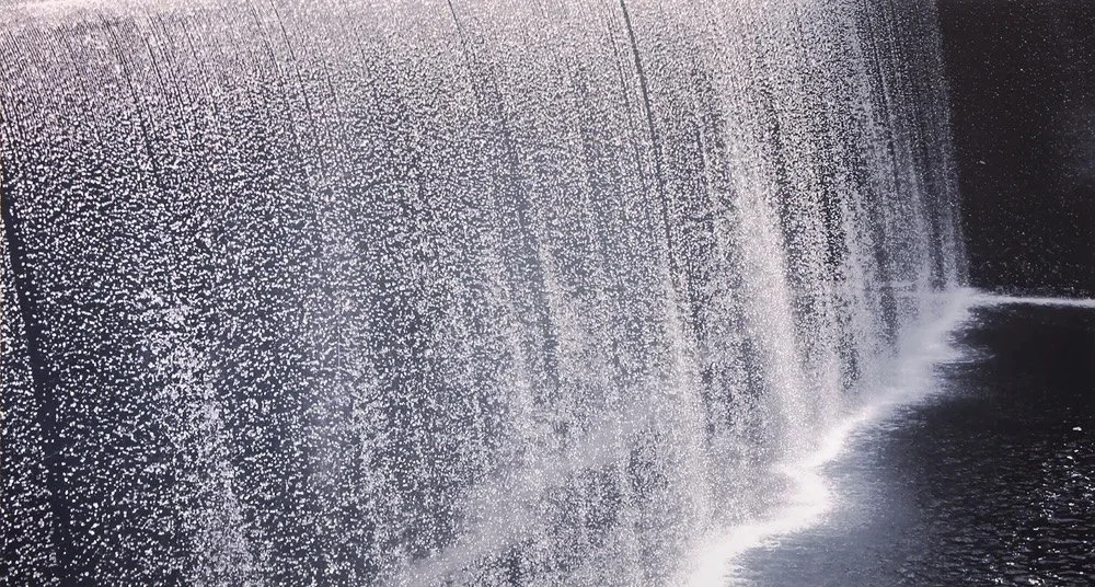
John Mackechnie, Falling Water 1. Screenprint, 57 × 106cm. 2015. Courtesy of John Mackechnie.
Many are in awe of the precision of these multilayer coloured creations. Mackechnie described his colour method as loosely based on CMYK order, but “I rarely use black”. He adds purples, oranges, and other colours in varying strengths, and uses an underpainting approach of printing stronger colour than needed, then overprinting with opaque and translucent layers to tone the image down, before building it back up. He relishes the effect of colour glowing through translucent white as “quite bewitching”. The intended perceptual result is a visceral, tactile quality that could not be achieved in a digital print, combined with archival permanence, a professional outcome. This is why he continues to make physical, hand-printed, multi-layer screenprints rather than simply exhibiting digital prints. “I love photography, although I wouldn't consider myself a photographer. More an artist that loves to use photography and printmaking to create images.” [16]
Other photograph-derived prints have included the American Beauty series, developed from digitally printed manipulated images of older photographs, among the earliest works he produced using early archival-quality desktop printing, and named after the film; a “film noir” series of etchings/mezzotints based on six popular films — Rebel Without a Cause, Taxi Driver, Mean Streets, Five Easy Pieces, The Big Sleep and The French Connection – but recreated to be completely different from the real thing. He plans in the near future to create a further series based on film scenes of characters looking at themselves in mirrors, partly inspired by a 1920s etching by the artist Gerald Leslie Brockhurst.
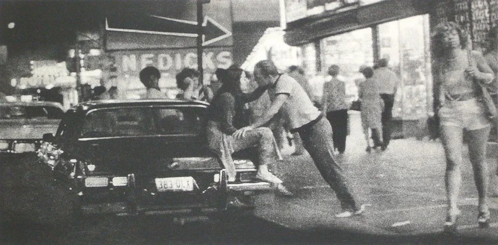
John Mackechnie, That Taxi Driver. Etching. Dimensions Unknown. 2000s. Courtesy of John Mackechnie.
This scene is far removed from the colour images of tranquil waters on various foreshores. The USA is the single most important “elsewhere” in Mackechnie’s creative output, and the film noir series continues his ambivalent fascination with aspects of American culture. Each image tells a powerful story. During lockdown, trapped in isolation, he set up a temporary studio in HIS front room and created a series of small acrylic paintings from his American photographs and film negatives. Each displays a brightly coloured American car, no driver or bonnet model in sight. “Some are in a parlous state yet still kinda sexy despite the rust creeping into the picture at various junctures.” [17] The work is all framed but unglazed. If ever work invited the viewer to touch, it's these images of late twentieth-century American life.
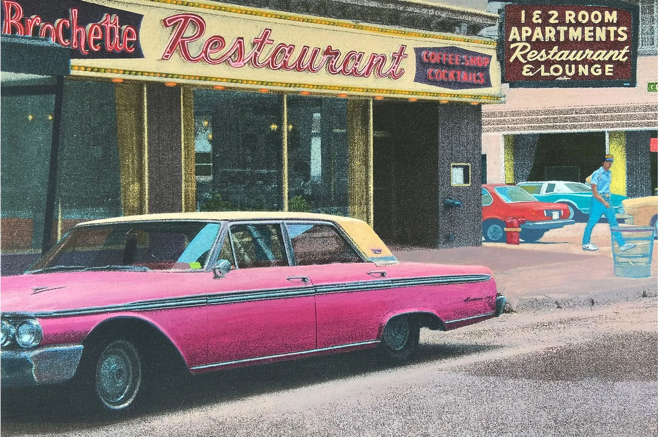
John Mackechnie, La Brochette. Acrylic on Linen. 40 × 61cm. 2021. Courtesy of John Mackechnie
One mark of authentic and irreplaceable creativity is that the artist ploughs an individual and very deep furrow. “None of the tutors at GSA knew what to do with me because the art school at that time was very traditional. My tutor, the painter Geoff Squire, said to me: ‘You know, John, it's very interesting what you are doing. I just can't help you.’”[18] John Mackechnie has initiated, developed and honed a technically demanding, personally distinctive style of art that cannot easily be imitated. The water images, for example, are very difficult to create and can require more than 30 separate screens of different colours, each perfectly registered to contribute properly to the composed whole. He admits to quite enjoying that they bamboozle people a little bit. Printmaking, for a master, is an intellectually demanding discipline: “If you're doing an etching, you're working in negative and mirror image, and it's like... you're working towards a goal, so it's like chess. You're working for three stages in advance.”
He has developed and taught new methods to other artists whilst leading the studio to create a professional impression and leave a lasting mark internationally. One hallmark of his work has been the employment of new technology. He describes himself as an early adopter of digital technology, continually adapting his working methods as the tools change: “I have to keep reinventing myself and finding new ways to use the technology.” Another is the evolution of core visual preoccupations such as reflection, pattern-making, and repetition so that very different compositions are linked, for example, his building and water imagery. Though political content has not been a major feature, there are some works that reveal his strong core ideals. In our conversation, he reflected on global connectedness, an element that certainly helps his work to speak in other countries.
Finally, John Mackechnie is motivated to create art that will be viewed, used by, and impact upon people, rather than be accumulated by a few. His is a democratic ethic: “I think I like to have work that's accessible to people. I don't really see the point of doing work that never sees the light of day. I think the work is really complete once it's on somebody's wall, because if it just exists in a plan chest, it's like — what was the point?” He bolsters this with a reverence for the art of others, being “open-minded, broad-minded and totally respectful of all other artists”. These values are recognised too by the Print Studio, which is “neither elitist nor populist”. [19] They underlie his enjoyment of print's capacity to be shared and gifted, for his neighbour’s milestone birthday for example, and they shape his own ongoing career ambitions.
Since the successful exhibition of his own work, to mark his birthday in 1999, he has extended his own oeuvre whilst continuing to forward other artists' careers. His high-quality work exemplifies the consistency that comes from five decades of dedication to printmaking. That artistic practice is now continuous and undiminished, and his prints have been procured for national public collections, UK and abroad. (Though surprisingly, and unfortunately, not yet for Scotland’s National Gallery). I very much look forward to his next piece of work, and to the public retrospective exhibition that his extensive, pioneering contributions to Scotland’s art certainly merit.
Joe Boyd
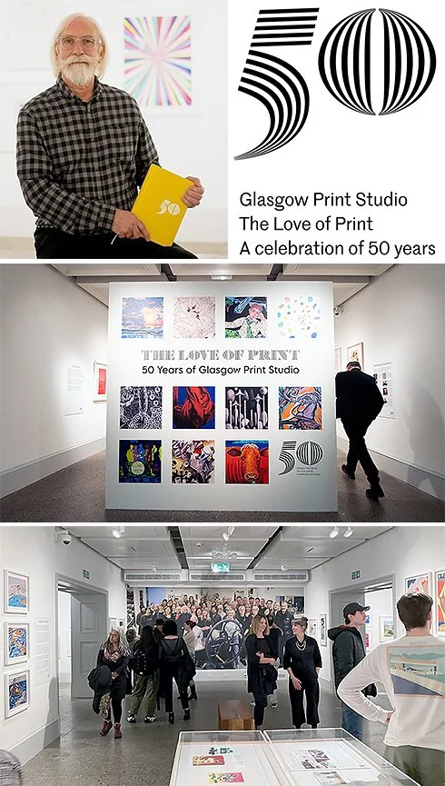
John Mackechnie and The Love of Print: 50 Years of the Glasgow Print Studio, held at Kelvingrove Art Gallery and Museum, 2022-23. Images courtesy of Glasgow Print Studio.
Appendix
Chronological summary
Born 1949
1960s: Attends Hyndland Secondary School, Glasgow: First printing experiences: screen-printed "cotton placemats" using stencils; wins silver medal at Glasgow's schoolchildren's art competition, Kelvingrove.
c. 1964 (age 15) – 1970 (age 21): Saturday job as copy boy, then "head boy," at the Sunday Express, Glasgow.
1967: Hitchhikes to Brighton with Glasgow friends, including Rab McInnes.
1967-1971: Attends Glasgow School of Art; influenced first by Motherwell/Kline, then by Pop artists (Warhol, Paolozzi, Lichtenstein, Rauschenberg); produces early screen prints/paintings using found and photographic imagery, including a "two-faced" painting of Spiro Agnew and Hubert Humphrey and "Candy Striped Democracy."
1971 Post-GSA: Attends Brighton Polytechnic's "Specialist Printmaking Group" for one year; begins colour etching; is asked to stay a second year and given part-time technician work.
c. 1973: Moves to Newcastle Polytechnic (now University of Northumbria) as a technician/lecturer for about five years, developing steel-plate etching technique.
Early 70s: Exhibits at the Thumb Gallery, Soho, London, with two Newcastle colleagues; begins travelling to the newly opened Glasgow Print Studio (1972) to make the Kibble Palace etchings; is then given evening-class teaching work at GPS.
1975: Given a full-time workshop manager post at GPS under a job-creation scheme; moves to Glasgow with wife and young baby.
1982: Institutional crisis at GPS (resignation of director and board); appointed Director & takes up post early 1983.
1982: First trip to America — a five-week photographic tour, the origin of his American urban-landscape imagery. Taken on by New York gallerist Karen McCready. Reorients the Print Studio to collaborate with artists and begins to build its international reputation as a creative centre.
1985: Takes GPS work to the London Art Fair at Olympia.
Following 1985: GPS begins showing at other international Art Fairs
1990: Glasgow's "Year of Culture" and a special exhibition programme at GPS.
c. 1996: Co-founds the first Glasgow Art Fair with Cyril Gerber, Roger Billcliffe, and Euan Mundy, modelled on the Bath Art Fair; runs for several years until city council funding is withdrawn.
1996: Proposes major refurbishments leading to development of Trongate 103, including a major expansion of Glasgow Print Studio's premises: new workshops, a gallery and a street-level sales area.
1999 (his 50th year): Turning point: gives himself a solo exhibition at GPS after realising, while promoting other artists, that his work is also good. The show includes monochrome screen prints from mid-1980s negatives and early digitally printed works on Somerset paper — his first return to sustained personal art-making since the early 1970s.
2001: September 11 attacks (Mackechnie on holiday in Minorca at the time); creates the tribute print Monument, exhibited exactly one month after the attacks; pivots thereafter to his ongoing water-image series.
2003: Elected to the Royal Scottish Academy.
2003: Second trip to America, retracing the 1982 route (New York, Chicago, San Francisco) in three weeks; begins a "crossroads" photography project.
2010: Exhibition; Destinations and Reflections. Glasgow International Art Festival 2010.
2018: Exhibition; Innovative Printmaking. Glasgow Print Studio.
c. 2023: Retires as Director of Glasgow Print Studio.
Recent (last 1–2 years before interview): Solo exhibition Uisge (water) at An Lanntair gallery, Isle of Lewis; repeated shows at Three Stones Gallery in Concord, Massachusetts; further Concord show planned for September 2026.
13 July 2026: Date of this interview, Glasgow.
Selected works in public collections
Mackechnie states, without giving an exhaustive inventory, that his work is held in a number of public collections, including:
The Metropolitan Museum of Art, New York.
Victoria and Albert Museum, London.
Great Ormond Street Hospital.
Aberdeen Art Gallery.
Various hospitals and clinics, NHS Lothian.
The Royal Scottish Academy collection.
Glasgow Art Galleries.
McManus Gallery, Dundee.
Hunterian Gallery, Glasgow University
Selected exhibitions, group and solo.
1984. Etching – Glasgow Style. Glasgow Print Studio.
2006. New Editions/Scotland. International Print Center, New York.
2016. The View From The Train, Glasgow Print Studio.
2017. Academicians’ Prints, Royal Scottish Academy.
2018. Innovative Printmaking, Glasgow Print Studio.
2019. The Original Print Show, Zillah Bell Gallery, Thirsk.
2019. Imprint: New Prints and Multiples by Academicians, Royal Scottish Academy.
2021. MONO, Glasgow Print Studio.
2021. Shifting Sands, Glasgow Print Studio (Solo Show)
2022. Intercity Prints, Glasgow Print Studio.
2022. Love of Print, Kelvingrove Art Gallery.
2023. The Christmas Show, Royal Scottish Academy.
2023. Glasgow in Print, Glasgow Print Studio.
2024. Impressions: Scottish Masters of Printmaking, Royal Scottish Academy.
2026. Chaos & Control: Printmaking in Scotland Now, Royal Scottish Academy.
Bibliography
Art UK website. 2026. https://artuk.org/search/search/search/2026--keyword:john-mackechnie--referrer:global-search
Boyd, Joe. 2025. Infused with Place. Ethics International Press
Glasgow Print Studio. 2023. The Love of Print: 50 Years of Glasgow Print Studio. https://www.glasgowprintstudio.co.uk/Home/DisplayExhibition/256?year=2023
Glasgow Print Studio website. 2026. https://www.glasgowprintstudio.co.uk/
Mackechnie, John. 2021. Two videos introducing ‘Shifting Sands’ Exhibition. https://www.dailymotion.com/video/x84k780 https://www.youtube.com/watch?app=desktop&v=btlPcKe1Hk4
Mackechnie, John. 2026a Transcript of conversation with the author, Kelvingrove, Glasgow. 13th July, 2026.
Mackechnie, John. 2026b website. https://www.johnmackechnie.com/
Mackechnie, John. 2026c Statement. Provided to the author by the artist.
Macmillan, Duncan. 2010. Review of Destinations and Reflections. The Scotsman Newspaper.
Murray, Roddy. 2026. Evocative seascapes light up new exhibit. https://welovestornoway.com/index.php/articles/42540-new-exhibit-coming-to-an-lanntair
Patience, Jan. 2021. Galleries: The pioneering John Mackechnie is still true to his original vision. The Herald newspaper. 18th October 2021.
Wiszniewski, Adrian. 2022. The Love of Print: 50 Years of Glasgow Print Studio catalogue. Glasgow Print Studio publication.
Notes
Note 1: From John Mackechnie website. https://www.johnmackechnie.com/about
Note 2: Or view online photographs at https://visitmull.uk/listing/calgary-bay-walk/
Note 3: Mackechnie, 2016a. Mackechnie’s spoken words are in quotation marks throughout.
Note 4: MacMillan, 2010.
Note 5: Murray, 2026.
Note 6: https://artuk.org/discover/artists/mackechnie-john-b-1949
Note 7: MacMillan, 2010.
Note 8: Mackechnie, 2026b
Note 9: https://time.com/3449718/mystery-in-the-sky-a-legendary-photo-slowly-gives-up-its-secrets/
Note 10: Glasgow Print Studio, 2023.
Note 11: View the results of these collaborations at ais.axiellcollections.cloud/GLASGOWPRINTSTUDIO
Note 12: Relph, 1976, passim.
Note 13: Mackechnie, 2026c.
Note 14: Adapted from Boyd, 2025, Infused with Place, pp64-71.
Note 15: Mackechnie, 2026.
Note 16: Mackechnie, 2026c
Note 17: Patience, 2021.
Note 18: Patience, 2021.
Note 19: Wiszniewski, 2021
Acknowledgements
With many thanks to John Mackechnie.
Many thanks to David Eustace for his permission to reproduce his portrait of John Mackechnie.